


February 01, 2013
F1 Pr0n: Ferrari F138
I do wish Ferrari would stay consistent with their numbering practices. Everybody else follows a pattern... last year's Red Bull was the RB8, the previous chassis was the RB7, the one before that was the RB6, and so on, and this year's will be the RB9. McLaren has the MP4-28, preceded by the MP4-27, -26, -25 and back through the years with nary a bobble. But Ferrari! The team that should be the MOST tradition-bound, the team that should be all about history? "Hey, Guido, it's your year to name the car... whaddya want it to be called?" The F138, which name will undoubtedly be considered a boon to the highlight editors at NBCSN, the BBC and SKY, comes from the calendar year (2013) and the number of cylinders in the engine (as a tribute to the last year of the V8 in F1). Tradition? We don't need no steenkin' tradition at Ferrari... we're the SCUDERIA, we do what we want and you'll like it. Because, whether or not you want to admit it, you want us on that track. You need us on that track. Without us, there is no great enemy to root against, and no prancing horse to root for.
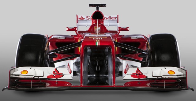
After last year's technical reorganization at Ferrari, the designers took a conservative approach to this year's car, making it much more of an evolution of the F2012 than an all-new car. Other than the obvious cosmetic difference from the modesty panel, it's really hard to see any difference at all from the nose. Oh, they cleaned up the front suspension, allegedly causing less drag, but other than that? I dunno, I can't really see anything.
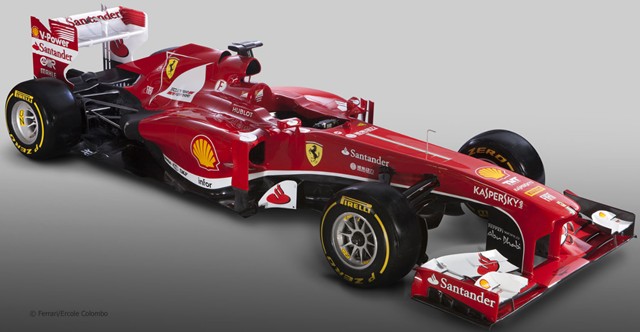
There's some fine sculpting to the sidepods visible from the 3/4s view, and the team is claiming that the entire rear end has been reworked, but I just don't see it. This isn't a bad thing. While not the most aerodynamic car in the world thanks to the team's windtunnel problems, the F2012 in the right hands (ie: HWMNBN) was awfully close to being a championship-winning chassis. If they get over the aero hurdle, maybe they'll be back to being 800lb gorilla FERRARI again, as opposed to...whatever it was they were at the start of last year.
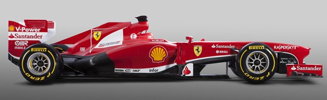
While I got used to the platypus nose, even thinking it gave the cars a certain charm, they do look better with the modesty panel. Not, it must be said, as good as two years ago, but better. And I DO have to take Ferrari to task for that white stripe along the bottom of the car. You're FERRARI. What color are your F1 cars? RED. The shade may change slightly, but it's RED. Idjits. All of 'em, idjits.
Force India is up next.
Comments are disabled.
Post is locked.
After last year's technical reorganization at Ferrari, the designers took a conservative approach to this year's car, making it much more of an evolution of the F2012 than an all-new car. Other than the obvious cosmetic difference from the modesty panel, it's really hard to see any difference at all from the nose. Oh, they cleaned up the front suspension, allegedly causing less drag, but other than that? I dunno, I can't really see anything.
There's some fine sculpting to the sidepods visible from the 3/4s view, and the team is claiming that the entire rear end has been reworked, but I just don't see it. This isn't a bad thing. While not the most aerodynamic car in the world thanks to the team's windtunnel problems, the F2012 in the right hands (ie: HWMNBN) was awfully close to being a championship-winning chassis. If they get over the aero hurdle, maybe they'll be back to being 800lb gorilla FERRARI again, as opposed to...whatever it was they were at the start of last year.
While I got used to the platypus nose, even thinking it gave the cars a certain charm, they do look better with the modesty panel. Not, it must be said, as good as two years ago, but better. And I DO have to take Ferrari to task for that white stripe along the bottom of the car. You're FERRARI. What color are your F1 cars? RED. The shade may change slightly, but it's RED. Idjits. All of 'em, idjits.
Force India is up next.
Posted by: Wonderduck at
07:32 PM
| Comments (3)
| Add Comment
Post contains 463 words, total size 3 kb.
1
What is that red sponsor logo that looks like a bunny-slipper with wings?
Posted by: Steven Den Beste at February 02, 2013 05:54 AM (+rSRq)
Posted by: Wonderduck at February 02, 2013 08:09 AM (cbg5Y)
3
Sorry, I didn't notice the white versions with the name.
Posted by: Steven Den Beste at February 02, 2013 09:11 AM (+rSRq)
25kb generated in CPU 0.215, elapsed 0.2733 seconds.
47 queries taking 0.2525 seconds, 279 records returned.
Powered by Minx 1.1.6c-pink.
47 queries taking 0.2525 seconds, 279 records returned.
Powered by Minx 1.1.6c-pink.

