


January 31, 2010
F1 Pr0n: Sauber C29
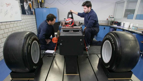
It was a low-key debut, but SauberF1 brought out their new car today. I think they're a little behind schedule, however.
The aerodynamics have got to be awful.
Okay, okay, click below for the real pictures.
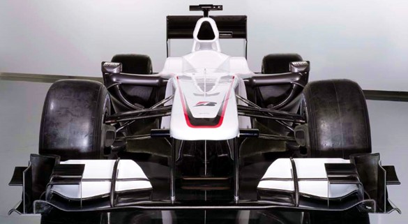
The surprising thing is that there's no sponsor's logos on the car at all, save the Bridgestone logo that every car has to have. Wonder if they're having financial difficulties, or if BMW is sneaking them cash under the table? I rather like the slight upward curve to the front of the sidepods. Still, from the front there's little to differentiate the C29 from the F10 or the MP4-25 for the most part.
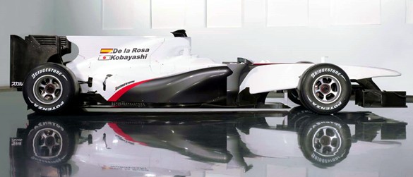
From the side, though, there are some subtle differences. The nose seems higher than the other two debuts, and the sidepod swoop is more like the McLaren's than the Ferrari. Actually, now that I look at it, the sidepods are closer to the style used in the 2009 cars than the new ones. The dorsal fin is much like the Red Bull RB5's last year.
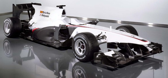
It's not a bad looking car, actually. It'll look differently once they put the Sauber blue and any sponsor logos onto it, of course, but the visible carbon fiber is nicely understated.
I'll bet you that this is going to be similar to the cars of the new teams.
Comments are disabled.
Post is locked.
The aerodynamics have got to be awful.
Okay, okay, click below for the real pictures.
The surprising thing is that there's no sponsor's logos on the car at all, save the Bridgestone logo that every car has to have. Wonder if they're having financial difficulties, or if BMW is sneaking them cash under the table? I rather like the slight upward curve to the front of the sidepods. Still, from the front there's little to differentiate the C29 from the F10 or the MP4-25 for the most part.
From the side, though, there are some subtle differences. The nose seems higher than the other two debuts, and the sidepod swoop is more like the McLaren's than the Ferrari. Actually, now that I look at it, the sidepods are closer to the style used in the 2009 cars than the new ones. The dorsal fin is much like the Red Bull RB5's last year.
It's not a bad looking car, actually. It'll look differently once they put the Sauber blue and any sponsor logos onto it, of course, but the visible carbon fiber is nicely understated.
I'll bet you that this is going to be similar to the cars of the new teams.
Posted by: Wonderduck at
11:21 AM
| Comments (1)
| Add Comment
Post contains 227 words, total size 2 kb.
1
Hmmm, I'm hoping that the lack of sponsor decals doesn't mean they don't have any.
From the side, the simple black and white looks like the car is wearing a tuxedo. Very elegant.
Posted by: Mallory at January 31, 2010 02:43 PM (WJ2qy)
23kb generated in CPU 0.0837, elapsed 0.1855 seconds.
47 queries taking 0.1574 seconds, 277 records returned.
Powered by Minx 1.1.6c-pink.
47 queries taking 0.1574 seconds, 277 records returned.
Powered by Minx 1.1.6c-pink.

