


February 02, 2013
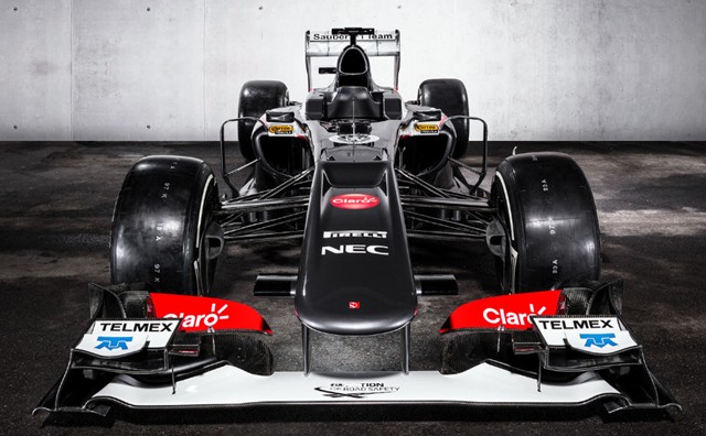
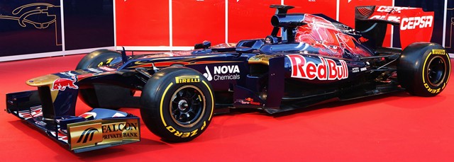
This ain't Peter Sauber's team anymore. It's also no longer the C31, and it's the first car this season to have some serious changes made to it. It's gone on a serious weight reduction program, with changed air intakes, and much, much smaller sidepods.
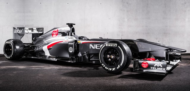
Forward of the cockpit, there's not much change. Everything aft of there, though... Apparently, when then-Sauber driver Sergio Perez had his serious accident at Monaco in 2011, one of the car's sidepods was heavily squashed. Car designer Matt Morris took a look at the result and said "I wonder if we can do that for real?" Here's the result. Slimmer sidepods, with the McLaren-style exhaust pipe exiting from the side of the pod. A much more compact rear end, with better aerodynamics around the rear suspension. Considering that there's nothing on the design that'll be able to be carried over to 2014, it's a remarkable job of design... makes me wonder when they started work on it?
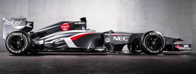
And dear merciful heavens, that livery! I'm sorry, but Peter's Saubers all looked friendly in their white schemes, but Monisha's? That's one badass-looking car! Menacing... not something I'd want to see coming up behind me. Maybe we'll see some movement in the standings from Sauber this year... I hope.
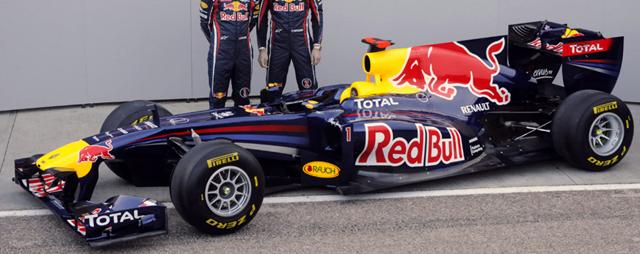
Red Bull are up on Sunday.
Posted by: Wonderduck at
10:48 PM
| No Comments
| Add Comment
Post contains 403 words, total size 3 kb.
February 01, 2013
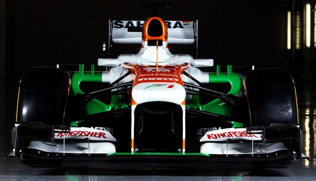
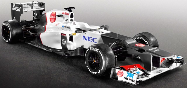
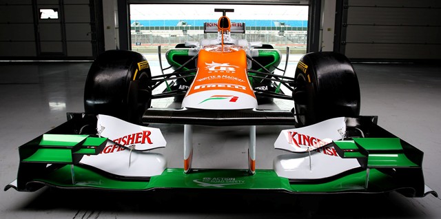
According to the guys in the white lab coats and the perpetually tired looks, the VJM06 is completely new, with nothing being carried over from the 2012 design. One of the advantages of being mired deep in the midpackers with nothing to really race for is the ability to give up a year, and that's what Force India did; they quit developing the VJM05 and concentrated all their efforts on the 2013 design. That all being said, other than a wider nose and the twin vanes on top of each sidepod, there doesn't seem to be all that much difference from the 2012 chassis... at least from the nose.
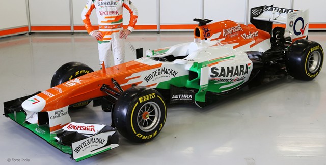
I'd just like to point out that the VJM06 is the first of the cars to come out that you can really see where the modesty panel is, mostly because it looks like it doesn't fit well on the Force India. Definitely less of an undercut to the sidepods in comparison to, say, the Ferrari.
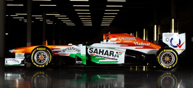
One thing they aren't doing is borrowing from the RB8 with the exhaust end of the sidepods; they look almost bulky when compared to, say, the Lotus E21. That isn't a bad thing, per se, and easily fixed if it turns out to be the wrong way to go, but one wonders if it's the right way to go. All in all, while the team may say it's an all-new design, I suspect there's less change involved than the team would have us believe. The technical regulations changed very little this off-season, so it's not like the car was suddenly going to be sporting bat wings and moose antlers in any case. If there's one team I'd like to see do well, it's this one... I just don't see it happening, though. We've been surprised before, however.
Sauber rolls out on Saturday, and the World Champions on Sunday.
Posted by: Wonderduck at
11:54 PM
| Comments (6)
| Add Comment
Post contains 414 words, total size 3 kb.
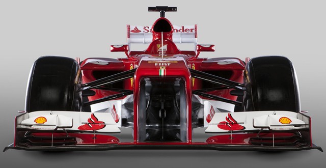
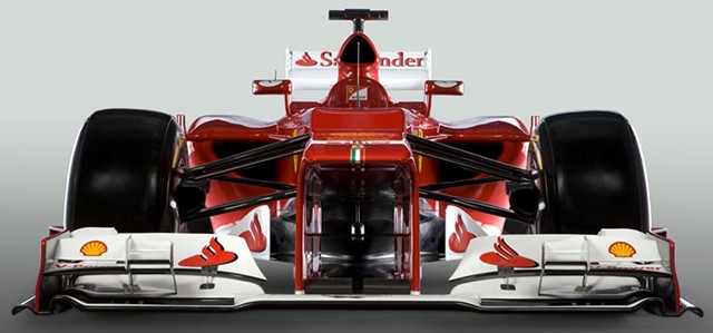
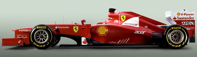
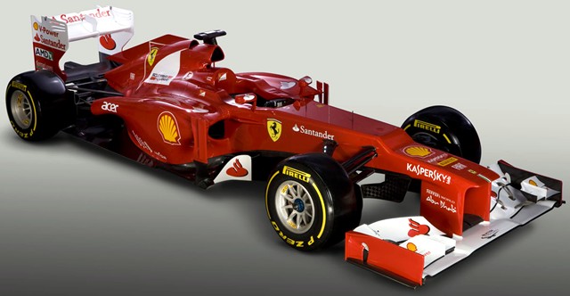
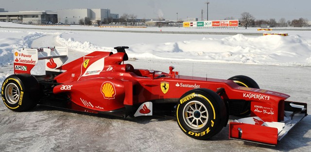
After last year's technical reorganization at Ferrari, the designers took a conservative approach to this year's car, making it much more of an evolution of the F2012 than an all-new car. Other than the obvious cosmetic difference from the modesty panel, it's really hard to see any difference at all from the nose. Oh, they cleaned up the front suspension, allegedly causing less drag, but other than that? I dunno, I can't really see anything.
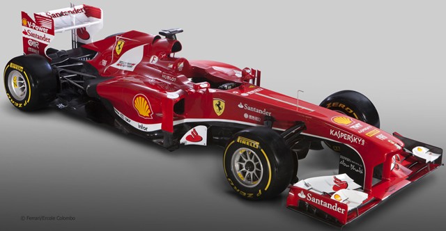
There's some fine sculpting to the sidepods visible from the 3/4s view, and the team is claiming that the entire rear end has been reworked, but I just don't see it. This isn't a bad thing. While not the most aerodynamic car in the world thanks to the team's windtunnel problems, the F2012 in the right hands (ie: HWMNBN) was awfully close to being a championship-winning chassis. If they get over the aero hurdle, maybe they'll be back to being 800lb gorilla FERRARI again, as opposed to...whatever it was they were at the start of last year.
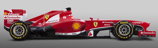
While I got used to the platypus nose, even thinking it gave the cars a certain charm, they do look better with the modesty panel. Not, it must be said, as good as two years ago, but better. And I DO have to take Ferrari to task for that white stripe along the bottom of the car. You're FERRARI. What color are your F1 cars? RED. The shade may change slightly, but it's RED. Idjits. All of 'em, idjits.
Force India is up next.
Posted by: Wonderduck at
07:32 PM
| Comments (3)
| Add Comment
Post contains 463 words, total size 3 kb.
January 31, 2013
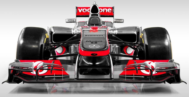
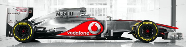
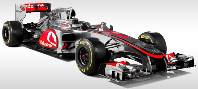
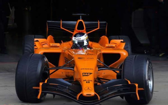
Ladies and Gentlemen, the McLaren MP4-28.
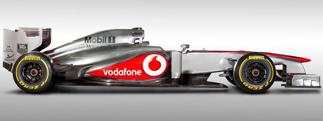
For all intents and purposes, there's only two differences between this and the MP4-27. One, the sidepods have a steeper slope front-to-back, though they didn't copy the Red Bull exhaust thing like Lotus did. The other obvious difference is the nose. Last year's rollout had a very low, long nose; the MP4-28, on the other hand, has something more like the nose run at the end of the 2012 season, when the McLaren was the fastest, though least reliable, car on the track. It looks shorter, though that's probably an optical illusion, maybe because of the installed modesty panel covering the step.
Other than those differences, there's one other oddball thing... the two sidepod inlets have completely different shapes, and each one has a different style/shape of mirror. I can only assume that this is temporary, and one will be decided upon before the first race. Though I wouldn't put it past McLaren to go full wacko on us... it's an odd-numbered year, after all.
Under the skin, there's reportedly a number of changes. They've copied the Ferrari pull-rod suspension for the front, and improved the rear pull-rod suspension by putting all the pieces into one housing, thereby cutting down on drag. Reportedly. For the life of me, I can't see it. That, however, is why they have people who get paid to spot things like that and I work in a bookstore. Okay, we've seen the rest of it, but now it's time for moment we've all been waiting for... and no staples, either!
more...
Posted by: Wonderduck at
09:36 PM
| Comments (4)
| Add Comment
Post contains 410 words, total size 3 kb.
January 28, 2013
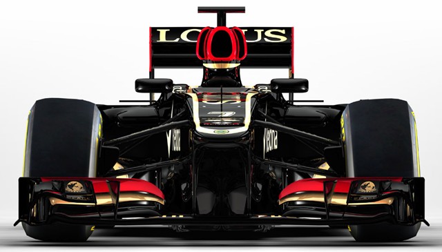
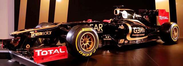
Which, at least from the front, looks very much like the E20. This is hardly a bad thing, as that chassis proved to be quite effective in 2012, moreso towards the end of the season. One thing that has visibly changed is the livery colors; there's more red and black, less gold. Purists may not like this as it doesn't "tip the hat" to the old Lotus "John Player Special" colors, but I could care less. The red looks great!
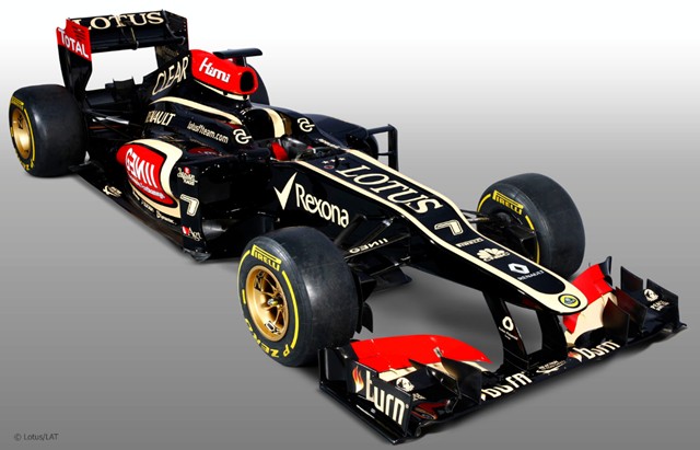
It's from this angle that the surprises start to really become visible. They're not using a "modesty panel" to cover the stepped nose; Lotus has said that they don't want to add any extra weight to the car, particularly high up, for mere cosmetic purposes. Now, if they can get a smidgeon of downforce out of it, however.... All the way back to the air intake, the E21 still looks like last year's car.
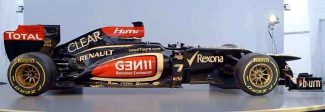
Whoops! Here's a difference: Lotus is copying the rear end of the Red Bull RB8 sidepods and exhaust exits. That'll bring the exhaust down and around the end of the diffuser, trying to get a bit of a blown diffuser effect, without having a blown diffuser (which would be illegal). Let's face it, if you're going to copy from someone, one may as well copy from the best, right?
Posted by: Wonderduck at
07:46 PM
| Comments (4)
| Add Comment
Post contains 332 words, total size 3 kb.
March 05, 2012
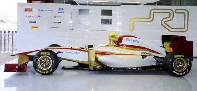
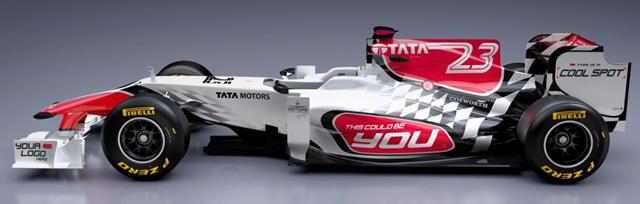
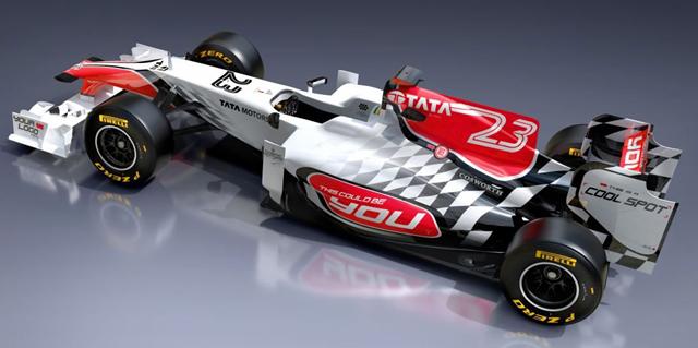
Y'know, say what you want about the team, and lord knows I will, but HRT has a good sense of what livery colors look good. I mean, last year there was the "begging livery", which pretty much captured the essence of every kid's idea of how a racecar should look. This time, it's a bit of a cap-tip to Force India's first two paintjobs. Appropriate, considering that Tata Motors is a major sponsor. Oh, the car? Well, the F112's nose seems weird. Maybe it's the paint, with the gold outlining the underside, but it sure looks like it's higher than other teams'. The platypus seems to be less pronounced, as well. From there back, though, it kinda looks like the team put last year's chassis in an oven and let it get all melty.
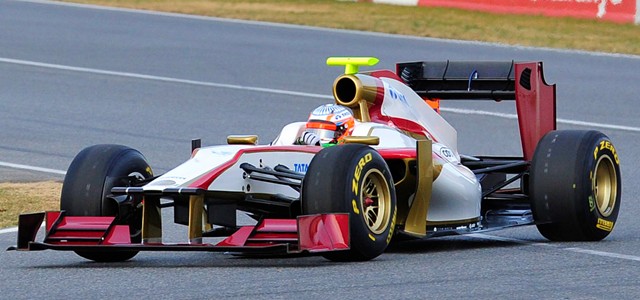
Otherwise, it looks quite a bit like other team's cars... which is a good thing for HRT. Means they are getting closer to the rest of the pack, design-wise... and with two season's worth of data under their belts, they should start getting results. In theory, at least.
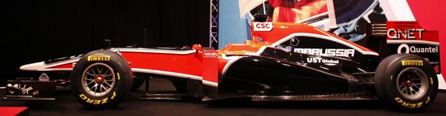
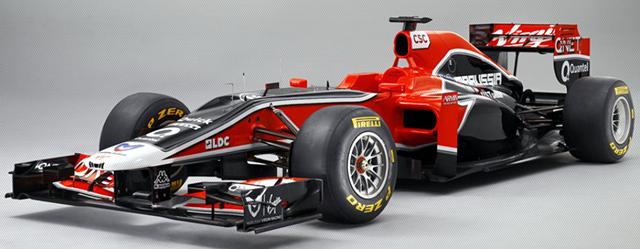
Now, onto the team that's been the worst on the grid for their entire life: TTFKAV!
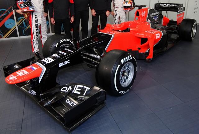
If you had told me that Marussia/Virgin/TTFKAV would be the only other team to use McLaren's styling for the platypus, I would have laughed at you. Red Bull, Ferrari and Mercedes couldn't/didn't, but Marussia did? Pshaaaaah, right. Except for the whole "technical partnership" between the two teams that I forgot about, but still, c'mon.
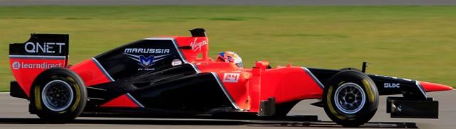
According to the team, the MR01 has very little in common with last year's VR-02. That's undoubtedly a good thing, but it could also be a case of "starting over from scratch." We'll find out soon enough. I'm still stunned by the nose. No shelf, no drop... just like the McLaren. The rest of the chassis looks pretty conventional, at least by the 2012 definition of "conventional." Just like HRT, they'll begin the season on the wrong foot, with no testing and no idea what problems are waiting to bite them in the butt. A team like one of the big four? They could maybe get away with no testing, but you know they'd hate it and they'd probably wind up flushing the season early. If Marussia or HRT are smart, they'll be using this season as nothing more than a really long testing session for 2013.
It's almost back.
Posted by: Wonderduck at
09:32 PM
| Comments (6)
| Add Comment
Post contains 514 words, total size 4 kb.
February 21, 2012
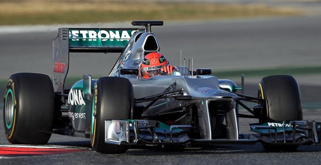
Apparently, Merc is kinda cheating just a little bit on the platypus. Only the outside edges of the bump are at the legal height... which fits the letter of the law, if perhaps not the spirit. Since this is F1, it's already been declared legal.
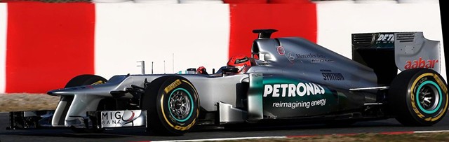
Small sidepods, small radiator intakes, not much of an undercut, a pair of extra intakes just behind the airbox... and oh my gawd the platypus looks completely hideous on the W03. Ross Brawn hisownself came out and said that the nose design "is certainly an acquired taste." So is the barrel of a shotgun.
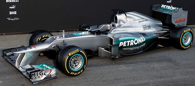
The team says that there's 4500 parts to the W03, up 200 from last year's car. They say that like it's a good thing, but isn't that 200 more things that can go wrong? I dunno; Merc is saying that they're going to make a run at the championship this year, and more power to them. But I just don't see it happening. They've been 4th the past two years, and while I'd love to see them jump Ferrari, McLaren and Red Bull, it seems like a stretch.
But then, they were once known as Brawn GP... and we all know what happened there.
Posted by: Wonderduck at
08:14 PM
| Comments (1)
| Add Comment
Post contains 234 words, total size 2 kb.
February 10, 2012
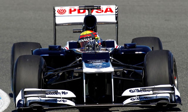
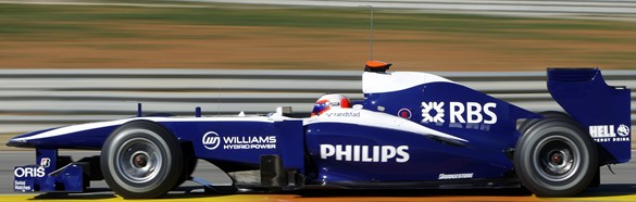
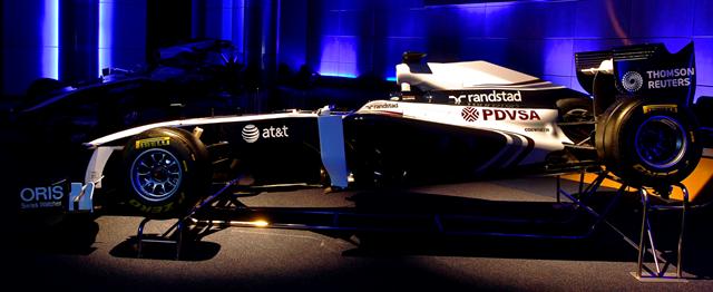
No less an individual than Sir Frank Williams hisownbadself has said that the new car has less than 5% parts in common with last year's FW33. In some ways, this is good: that car was a dog. It's also quite the risk, as F1 teams have historically found that evolution, not revolution, is the way to success. Again, though, the 2011 car was just bad and there probably wasn't all that much worth keeping. Having said all that... the Williams' paint job is terrible for seeing details. The platypus step looks like it's a vertical wall. It's not, but that's the way it looks. Big air intakes, maybe the largest we've seen so far. I'm amused by the Gillette sponsorship on the multi-level front wings... ladies and gentlemen, the twin-bladed razor of F1 cars!
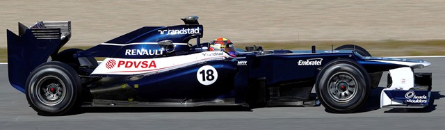
Wacky rear wing! The sidepods are small-ish, but nicely shaped. No undercut on them at all though. I HATE the the "flying" fin on the airbox. I'm sure it's aerodynamic, but I just don't like it. I'm kinda struggling for stuff to talk about with this car. Of course, I've talked about what, six or seven others already?
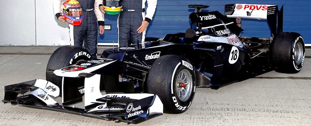
I've lowered the contrast by 50%, I've boosted the brightness by 30%, and increased the saturation, and the car still looks like it's sucking in all light within 20 feet. Ugly nose. Having said all that, I really hope there's some speed in this chassis. Formula 1 would be much better off with Williams being good.
I'll admit it: I got nuthin' here. The team sounds like they're excited about the FW34, but they would do, wouldn't they? On the other hand, I can't get excited about it. If everything goes right, does anybody realistically see them finishing any better than 5th in the constructors?
That's a darn shame.
Posted by: Wonderduck at
09:42 PM
| Comments (3)
| Add Comment
Post contains 387 words, total size 3 kb.
February 07, 2012
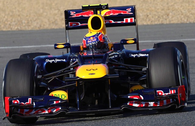
Well, that's different. Red Bull's solution to the platypus nose is to hollow it out... which makes sense, once you think about it. That vent is certainly being used to cool the driver, the electronics, or both. It probably does away with a lot of the drag caused by the stairstep, too... or at least removes much of the disturbed airflow from where it'd do the most damage, aerodynamically. The sidepod inlets are smaller in comparison to last year's runaway winner, though not dramatically so.
In fact, there aren't all that many changes from the RB7 (above, bottom). I mean, beyond the obvious platypus nose. The airbox cover doesn't have the thin fin any longer and the verticals on the rear wing are now square with dangling "fingers", as opposed to the curved cut of last year's car. The sidepods don't look as high, but they also don't seem to slope down as far. So, not many obvious changes, but that shouldn't be a surprise... I mean, it's not like the RB7 wasn't the best car around in 2011 or anything. As I mentioned last year, any changes are probably under the skin.
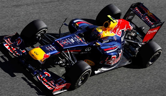
After looking at the slot in the nose, I think we've finally figured out where Mark Webber and Seb Vettel have to slide their timecards. That nose might just be the worst of the bunch... what is it that it reminds me of? Oh... oh yeah, I've got it.
Posted by: Wonderduck at
08:17 PM
| Comments (2)
| Add Comment
Post contains 341 words, total size 2 kb.
February 06, 2012
Proof that it's possible to make a good looking platypus nosed F1 car. Of course, this isn't surprising, because the Renault Lotus E20 appears to be last year's Renault Renault! It appears that the team had to do quite a bit of engineering work to re-route the forward facing exhaust system to meet the tech regs, and as a result development on the rest of the car stagnated. The platypus nose is nothing particularly difficult to accomplish, obviously. However, Renault Lotus actually managed to make this one look good... or at least, not as awful as all the others. It's not the hideous ramp that Ferrari has, nor is it the "hills and valley" used by the other teams. Other than those changes, though, it really is the Renault Renault R31, all over again. That may not be a horrible thing.
Like Renault Lotus, Sauber's C31 seems to be a C30 in 2012 regulations, there are a few changes. Obviously the platypus nose is present... but the hump has a trick involved. There's a thin gap where the nosecone meets the hump, apparently an attempt to disrupt a little bit of the drag that'll undoubtedly be created by the thing. Will it work? Who knows? Other changes are a touch more subtle. The sidepods, which were already cut down last year, have been even smaller and more rounded. The top of the car from the cockpit to the front tires is flat; last year it actually was angled up from the cockpit to the tires. The whole chassis is very clean, almost austere in looks. I rather like it. The biggest change, though, is the addition of Oerlikon as a sponsor. Does this mean there's a 20mm autocannon hidden in the airbox?
Toro Rosso's STR7 has a "hills-and-valley" approach to the platypus, which is as good as any, I suppose. I suppose it's boring to say that it's very similar to last year's STR6, so I won't... though it is. The sidepods are shorter and more deeply cut than those on last year's car, which should remove quite a bit of parasitic drag from the chassis. The airbox has an interesting support arrangement to it now, and under the main intake, there's a second intake, presumably for cooling the KERS unit. Something that isn't particularly visible in the pictures of the cars rolled out to date is the position of the exhausts. Toro Rosso's is set about as far back as they can legally go, and their position seems to be blowing right onto the rear wing. "We can't use a blown diffuser, but nobody said anything about a blown rear wing," seems to be the plan.
In an interview with Toro Rosso's designer, Georgio Ascanelli, I finally heard an explanation for the new nose height. It seems that the maximum height of 550mm is the same as the height of the anti-penetration panels on the sides of the cockpit. It was done to prevent an impalement, which of course we've seen dozens of times in the past couple of years alone (/sarcasm off). A solution looking for a problem...
Now, sharp-eyed readers might have noticed that I said that there had been FOUR rollouts over the past two days, yet I've only shown three. That's because the fourth team was Red Bull, and all they let us see were a couple of cheap renders of the car they'll be defending their title with. With the first offseason practice session beginning on Tuesday, I expect we'll be seeing a little more than that tomorrow, so I'll hit it and Williams then!
Posted by: Wonderduck at
08:56 PM
| Comments (2)
| Add Comment
Post contains 691 words, total size 5 kb.
February 03, 2012
Though to be honest, from the front it looks not so bad at all. The front wing is supposedly evolved from the flexi-bendy wing they ran at the end of the 2011 season. For their sake, I hope they got the "oscillating like a USGS seismometer in a magnitude 9.5 earthquake" feature fixed. There were times when I wondered how the Red cars were able to stay on the track, even going in a straight line, because of that wing flapping like an ornithopter.
From the side, it still doesn't look so bad. Like the McLaren, there appears to be an angle (back-to-front) to the floor. The sidepods are deeply undercut, more like the Force India than the McLaren, though not the same sort of profile. Amazing how so many teams can do the same thing, but come up with completely different designs. It'll be interesting to see which one comes off the best. One thing that comes back from past designs is the weird double rear bodywork thingy on the engine cover. I've never been fond of that design element, and it doesn't look any better here. It looks like the engine cover came off the sprue badly and nobody bothered to trim the flash off.
...and now the hideousness of the nose becomes apparent. Yeesh... if anything, it may be worse than the Lotus Caterham and the Force India solutions. However, this does raise an interesting question: just how did McLaren's nose fit under the technical regulations while a team like Ferrari does... this? Interesting that there's another fin between the front wheels; haven't seen that before, have we? According to the team, the car is almost all brand new, with very little coming over from the F150° Italia. I gather the rear wing is pretty much the same, with just some very minor tweaking.
The Scuderia was to have a huge blowout at the Ferrari factory at Maranello, followed by a few laps at the team's test track, literally right across the street. One little problem, though: it's been snowing in Northern Italy. A lot. So instead of the big media presser and hot laps, we got... well, this:
I'm pretty sure they trucked it to the track. I mean, could you imagine driving a F1 car... in the snow... on slicks? I suspect the car would be in the wall, on its back, and on fire, within a few feet.
Renault Lotus is next up on Sunday, followed by a F1 MegaPr0n on Monday, when Sauber, Toro Rosso, and defending constructor's champion Red Bull all roll out. See ya then!
Posted by: Wonderduck at
08:49 PM
| Comments (9)
| Add Comment
Post contains 541 words, total size 4 kb.
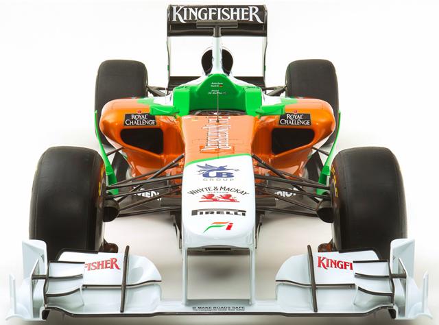
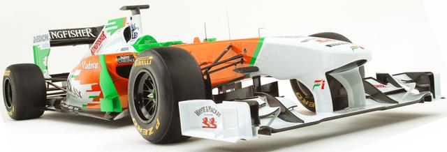
Platypus. Definitely platypus. The people who know these things say that Force India used the same wing for two years, with the team issuing upgrades and developments at various points over those seasons. It appears that the VJM05 is rockin' a new, more complex, front wing that some suggest will be flexi-bendy, like the Red Bull's. If they can pull that off, it'll be a major coup. Remember, Ferrari couldn't make it work, ending up with something that flapped like a hummingbird's wing. This had a rather unfortunate effect on the structural stability of the car.
The sidepods are longer than the McLaren's, but seem to have a bigger undercut to them. Other than that, the chassis seems to be fairly conventional. Smooth airbox.
The platypus nose looks hideous in this picture. Unlike the CT01, this one has a rounded nose, again similar in appearance to the Red Bull designs. Though we can't see it in these shots, I gather that the underside of the nose is also rounded, better to shed air in the direction of the underside of the car and increasing the downforce. The, for lack of a better term, "barge boards" just to the outside of the sidepods seem much more prominent than they do on the other two chassis that have been rolled out thus far. I'm sure they're perfectly legal, but I'll be switched if I like 'em. The nicest rule change in the past five years was the one that got rid of the proliferation of such things; these bring back unpleasant memories.
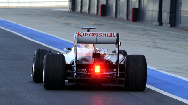
I suspect this is a make-or-break season for Vijay Mallya's team. It's been five years without a win, only one podium and just one pole, both of which look like flukes. There are reports that Mallya's financial empire is showing cracks; Kingfisher Airlines paid their salaried employees late four months running, for example. If this is truly the case, one could reasonably assume that F1 would prove to be something totally disposable... unless good things start happening in a hurry. We'll see how the VJM05 does down the road!
Ferrari's rollout will be covered tonight.
Posted by: Wonderduck at
09:24 AM
| No Comments
| Add Comment
Post contains 391 words, total size 3 kb.
February 01, 2012
The first thing that leaps out at you is... the more or less normal looking nose. As we'll see in the next picture, all is not as it appears, though in comparison to the Lotus Caterham, it's boring. The air intakes on the sidepods are back to something a little more staid than last year, though they are somewhat... elongated. The section directly under the nose is a little busier than last year.
As with the Caterham before it, the MP4-27 has teeny sculpted sidepods, clearly to steer more air towards the back. As mentioned earlier, the nose doesn't have the stonking great stepdown like the CT01, but it does rather plummet. It's a graceful plummet, but compare it to the MP4-26, and you'll see the difference:
The rear wing of the new car also has... fingers at the bottom of the rear wing assembly. These started to appear on the cars last season, and I'm sure there's something good aerodynamically involved with them, but I'll be switched if I can figure out what it is. I'm not the big brain though, as anybody who's read The Pond could attest to.
No matter how fast the MP4-27 goes, there is one thing you can say about it: it sure is purty. I think they need to go back to the silver rims though. The black just doesn't work.
Now for the best thing of them all: the annual McLaren centerfold! Just click "more" for some sweet sweet Glare On Wheels action, sans staples!
more...
Posted by: Wonderduck at
08:36 PM
| Comments (5)
| Add Comment
Post contains 326 words, total size 2 kb.
January 26, 2012
Some interesting stuff here from Caterham. The sidepods are shorter, making for a more compact, almost wasp-waisted, chassis. Unseen in the picture above is that there's a vent in the back of the airbox to add cooling to that which the smaller sidepods lose. The exhausts are low-mounted and positioned in the lee of the sidepod's airflow. The leader at the clubhouse turn is that they'll blow over the lower elements of the rear wing, trying to claw back some of the downforce lost by the banning of blown diffusers. However, the F1 sites across the interwebs are all abuzz over the nose.
To be charitable, it's not pretty. To not be charitable, it might be the ugliest nose since the 2004 Williams "Walrusnose"... or this one. Unfortunately, that stepdown is mandated by the new tech regulations. Yes, really. It's a safety feature, designed to keep cars from being launched, somehow. I think it accomplishes the feat by being so repulsive that no self-respecting F1 chassis would deign to approach it. I tells ya, Morty, it's like it got taken back behind the woodshed and got beaten with the ugly stick. And because the rules require that the nose be no more than 550mm above the ground, but the rest of the body has to be 650mm above, we'll probably see this on EVERY car this year.
BEHOLD! The era of the ugly F1 car is upon us, and woe be unto those who think that the individualism of the teams is being legislated out of the sport by the FIA.
The next rollout is McLaren on February 1st! See you then for more F1 Pr0n!
Posted by: Wonderduck at
08:39 PM
| No Comments
| Add Comment
Post contains 381 words, total size 3 kb.
March 11, 2011
Well, no longer. This year, they're going to get their car on-track for one day's worth of preseason testing (UPDATE: see below). And this year, the car looks oh-so-fine.
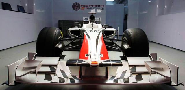
When HRT released renderings of the F111, I asked for a good nose-on shot. Now that we've gotten one, I have no idea exactly why I wanted it. It's definitely the steepest nose-droop out there. The brake ducts are large enough to swallow a track marshal, just like last year. Sidepod intakes are basically the same as everybody else, more or less. One thing of note is that the nose incorporates the FIA-mandated camera mounts (the black horizontal structures to either side of the Spanish flag) into the actual design, where everybody else just mounts them to the side. They're supposed to be aerodynamically neutral, but I can't help but think that doing this is to the F111's advantage. The front wing is much more complex than I expected to see from the team.
From the side, the most striking thing about the car is the livery. I said it earlier and I'll say it again: this is how a race car should look. The eye-catching graphics appeal to the eight-year-old in me, I admit it. The sponsorship begging is a bit of a turn-off, but hey, they need the money and they've got the space, why not? Other than the low, droopy nose and the paintjob though, the rest of the car looks pretty average. It looks like a F1 car, and that's not a bad thing at all.
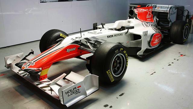
Team boss Colin Kolles claims that the car will be "significantly faster" than last year's charger. They've got the same powertrain that the Williams team is using, and we know how that worked last year; in theory they could be a surprise. My guess? They might get a point or two for the entire year, if they last that long. Let's hope they do.
UPDATE: Late news from Spain is that HRT will not be participating in Saturday's testing session. They have important parts of their car held up in customs, and nothing they've been able to do have managed to get Spanish officials to release them. That can't be a good thing. Even one day of testing would have been a boon beyond measure for the team.
Posted by: Wonderduck at
09:19 PM
| No Comments
| Add Comment
Post contains 525 words, total size 4 kb.
February 24, 2011
Which is why I'm going to do a quick look at the newly revealed livery for Williams' 2011 challenger, the FW33. As you may remember, the paintjob has remained the same for Williams for a few years, pretty much looking like this:
...and that's fine. It's bland and conservative, but that fits Williams' institutional character to a T, at least recently. Then, as usual, they began the offseason sessions in a testing livery:
I'll be honest, I really like that plain look. Glossy dark blue with just a simple car number in a white circle? Classic, give me more of that please. But of course, testing liveries never last (anybody remember Force India's original paint job? Baby, was that one good!) and we knew that this one would be no different. So today Williams brought out the official livery for the FW33, and what do we get?
Well, it is different from the past few years, I'll give it that... just not particularly different. Supposedly it's supposed to be paying tribute to the mid-90s livery, when the team was sponsored by Rothmans, and I guess I can see that. I guess. Sorta. It's got stripes.
And the stripes have colors other than blue and white! Cue the marching bands and parading elephants, a miracle has occurred. But there's something missing... something important... oh yeah! The name "WILLIAMS"... you'd think they'd want to have that somewhere on the car, wouldn't you? Most of the other teams have their own name some place on the chassis; it seems weird for Williams not to.
Oh, there it is... sure, everybody'll see that.
Posted by: Wonderduck at
06:43 PM
| No Comments
| Add Comment
Post contains 345 words, total size 3 kb.
February 08, 2011
Sort of a big, chunky kinda nose on this one. Ferrari-style sidepod inlets, Lotus-style split intake above the driver's seat, Red Bull-style high nose, McLaren-style flat forward section... it's a Frankencar!
I kid, of course. I'm sure nothing here is copied from other designs, it's just the way F1 cars look these days. Is it just me, or is the very front of the underside of the nose... hollow? Covered with a smoked-glass-like thing? Like a sensor pod on a jet plane or something? It's hard to tell, but it'd make for some hellacious camera shots if that's what's going on there! Force India is talking seriously about contesting for fifth place in the constructor's championship in 2011. If that happens, that'd be a huge step for the fourth-year team that's shown occasional flashes of brilliance. For it to occur, Vijay Mallya will have to pour a lot of cash into the team over the course of the whole season. If you remember, Force India started out quite strongly, but as the bigger teams developed their cars, they couldn't keep pace. It'd be cool if they could... I'd love to have a team to root for again. Also in passing it turns out that FI has decided on their driver lineup for 2011 but forgot to make a formal announcement: Adrian F'n Sutil and rookie Paul di Resta, with Nico Hulkenberg as reserve driver (for now). Di Resta, a Scotsman, was the team's reserve driver last year and won the DTM championship as well. So yeah, he's got that going for him, which is nice.
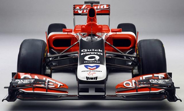
Onto last year's winner of the ugliest car of the year award, HRT!
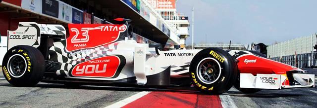
HOT DAMN! Now that's what a race car should look like! Except for all the begging for sponsorships going on that is... "Your Logo Here"? "This Could Be You"? "This Is A Cool Spot"? Guys, I understand how desperate you are for cash, but geez.... To be honest though, the checkered flag really should be replaced with a blue flag... truth in advertising, y'know? Helluva nose on the HRT F111... actually, come to think of it, didn't the F-111 Aardvark have a droopy nose, too? Throw in the movable (rear) wing, and I'm more and more amused by the comparison. I wonder if it can do a dump-and-burn?
Darn it, I really want to see a nose-on picture of this beast now. It'll be taking the track at the third test session in a few weeks, hopefully we'll get some good pics then, as opposed to these, which I'm almost positive are really good computer renderings. I wonder what their cost schedule is for some of those sponsorship locations? I might have to put up a tip jar, see about getting a rubber duckie on the car for a race. Now that'd make it the single coolest livery of all time! Still no idea who their second driver is going to be... "This could be you" takes on a whole different meaning all of a sudden.
Posted by: Wonderduck at
08:30 PM
| Comments (4)
| Add Comment
Post contains 558 words, total size 4 kb.
February 07, 2011
As with last year's car, this one was again designed and tested entirely in a computer, using Computational Fluid Dynamics (CFD) software. No wind tunnels for these guys, no sir. One could say that the CFD technique worked acceptably last year, though the team ended up dead last in the championship standings, behind even lowly HRT. To be fair, that wasn't so much the fault of the car design as it was the innards... it seemed like every race, one or both of the cars were breaking down due to a hydraulic failure or the gearbox turning itself into a wide selection of Neutrals. The chassis itself was fairly quick, all things considered. However, last year the body was built by Dallara and reminded me of another Dallara product, the IndyCar chassis. The needle-nose in particular stood out. Well, this year the team is doing the building on their own, and the nose immediately leaps out as being different. Much wider, though still lower than everybody else.
So the computers are suggesting that everybody else, with their high nose, is wrong. The rest of the chassis is pretty conventional. Nothing leaps out at you and says that Virgin is taking a risk here, though Nick Wirth, team technical director, says that they looked at using the Renault forward-facing exhaust. They decided not to use it, mostly due to the costs involved.
Y'know what? This might just be a generic F1 car. That's not a bad thing, by the way. "Generic" is a huge step up from "Dead Last" like last year. "Generic" is also a pretty solid strategy for a new team. If you make radical changes all over the place, you might never figure out which ones work... and which don't. Virgin is claiming that they'll be playing with the Toro Rossos and Saubers of the world this season... that'd be a heckuva improvement, and I wish them luck with that. That'd mean they'd be consistent point scorers in 2011, quite the leap in one year. It took Force India three years to get to that point, after all. Well, we'll see soon enough.
Posted by: Wonderduck at
08:00 PM
| Comments (3)
| Add Comment
Post contains 378 words, total size 2 kb.
February 04, 2011
But of all the teams out there, McLaren is the only one with an institutional sense of humor. And McLaren occasionally does roll out the weirdness; witness the original "viking horns" on the MP4-21, for example. So you never be sure what's coming from these guys... and without a doubt, the team went into full goofy mode this year.
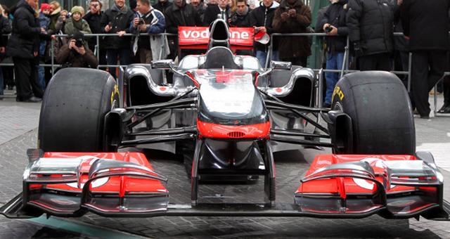
What in the name of St Fangio the Quick is going on with those sidepods? Oddly, I believe the viking horns might just give us the answer. Besides the obvious increased airflow into the radiators, I wonder if the odd shape of the 'pods don't give much the same effect as the viking horns, just in larger scale, with air being channeling over them and back towards the rear of the car. Should be fascinating to see how that works out.
Seen from the side, the car looks almost normal. Lower nose than on many of the others, with a very long, shallow descent all the way from the cockpit to the tip. Still, the odd sidepods make the MP4-26 look like it has hunched shoulders. I rather like the look of the car, honestly. Very clean. Swoopy, but not looking like it was drawn in the middle of a fever dream.
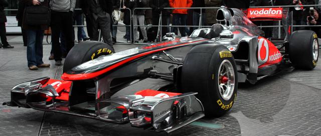
Even prettier from this angle. The odd shape of the 'pod intakes are quite visible here. I wonder... does that shape allow it to claim more of the air coming off the front tires? It might be rather roiled up air, but it's still air to cool the engine. The front half of the car is just gorgeous... so clean, and such a change from the front of the Ferrari and Red Bull. One thing that you might notice is the double air intake above the driver's head. The one in the normal position is for the engine, as you might expect. The one farther back along the fin is probably for cooling the KERS unit.
One last picture, the annual McLaren centerfold. It's a big one, but there's no staples to get in the way. Enjoy!
more...
Posted by: Wonderduck at
08:27 PM
| Comments (3)
| Add Comment
Post contains 447 words, total size 3 kb.
February 03, 2011
Last year, the T127 was very much a throwback car, all slab-sides and table-flat. None of the aerodynamic swoops and curves we've come to expect from a F1 car there! Now, however, they seem to have jumped right into something more like the old teams. The big surprise is the air intake over the driver's head... they're using a split inlet, like the one Mercedes started 2010 with. I'm unsure as to what the advantage of using such a thing is, while there is at least one known disadvantage, namely unsettled and unbalanced airflow in a turn. When the car turns, the side opposite the direction of the turn gets less air, and in some cases airflow may be blocked altogether. Perhaps the Lotus engineers don't think this is a problem, or the lessened drag caused by a blanketed air duct balances the reduced airflow, or the whole problem is overblown in the first place. Still, Mercedes dropped it fairly quickly.
Lower nose than most of the other cars this season, though it's a sharp dropoff. The body surely isn't as slab-sided as it was last year, though it still seems less swoopy in the sidepod area. I suspect the biggest improvement to the car will not be in the aerodynamics, but in the Renault engines they'll be running for 2011. No knock on Cosworth, they did a great job last year, but the Renault is a definite step up, and will probably be enough on its own to keep Lotus as the best of the new teams. Will it be enough to let them play with the established teams? Well, if any of the newbies are going to, it'll be these guys. I'm sure they're aiming for points this year.
According to the team, the T128 has been designed up from scratch, using none of last year's car as a basis. It certainly looks more modern, but I wonder if that's a good way to go. The good teams got that way by building on the experiences of their previous seasons, for the most part keeping the good parts of the older designs and improving the not-so-good parts. Evolution, in other words, not revolution. To be sure, evolving a bad car isn't exactly an easy thing to do, but at least they'd have some running data to work off of. If this one was indeed begun from scratch, they'll be back at square one again. Guess we'll see... they get paid a lot more than I do to do this stuff, so they must have a better handle on it, right?
Posted by: Wonderduck at
10:47 PM
| Comments (1)
| Add Comment
Post contains 466 words, total size 3 kb.
58 queries taking 0.1161 seconds, 200 records returned.
Powered by Minx 1.1.6c-pink.


.JPG)