March 24, 2017
F1 Pr0n: The Cars 2017
After the
debacle learning experience that was my last attempt at this post, I gave it another shot last night. After about 20-25 minutes of work, my internet connection went out. In this case, however, it wasn't my provider's fault. Instead, it was like my ethernet card forgot how to ethernet. I wound up having to create a new network altogether, which wound up being deathly slow because it didn't understand the concept of IPv6. After exchanging a series of text messages with Ben,
the lovely and talented proprietor of Midnight Tease, who
happens to be the inventor of the cable modem can create networks with the power of his mind understands Windows networking, everything... just started working again. Unfortunately, by then it was stupidly late and I still had to work the next morning. Which is why this F1 Pr0n post is happening just a few hours before qualifying for the first race of the season. I'm half expecting a meteorite to hit my monitor while I'm working on this post now.
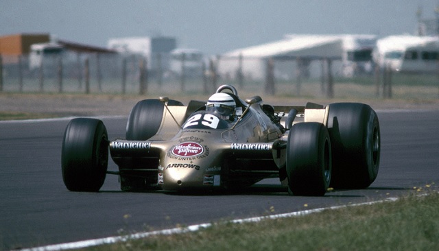
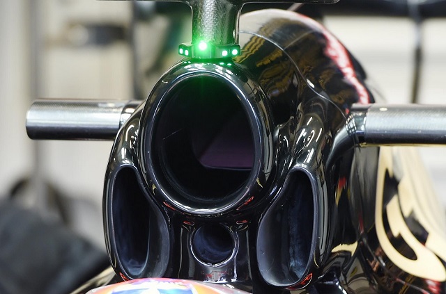
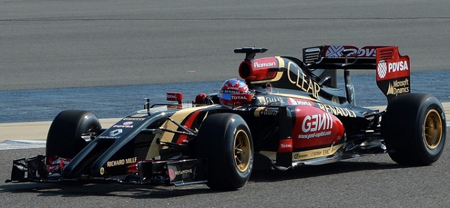
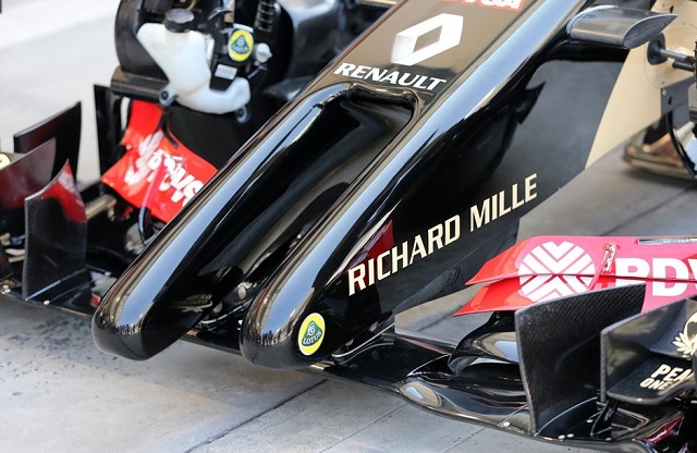
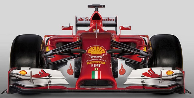
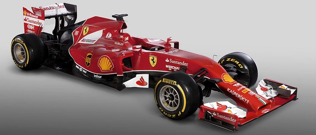
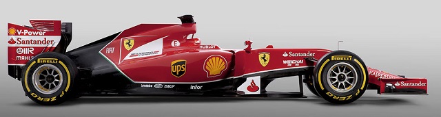
So. The cars. Sure, we talk about the drivers, the tracks, the glamour and glitz, but the real reason we watch Formula 1 is the cars. There were a bunch of changes in the tech regs for 2017... the cars are wider, as are the tires. The rear wing is wider
and lower. The dorsal fin has returned, as have aerodynamic fiddlybits. And the upshot of all of this is that the preseason pundits prognosticate the cars will be a full five seconds per lap faster than they were in 2016. What does this mean? Well, Lewis Hamilton's 1:24.220 fast lap in Practice 1 compares quite nicely to Australia's lap record of 1:24.125 set in 2004. By a car with a V10 engine that rev'd up to 19000 rpm,
which sounds something like this. Oh, and the 2004 cars are generally considered to be the fastest ever. So, guess the new tech regs worked! Wanna see the results?
more...
Posted by: Wonderduck at
11:59 PM
| Comments (1)
| Add Comment
Post contains 1321 words, total size 10 kb.
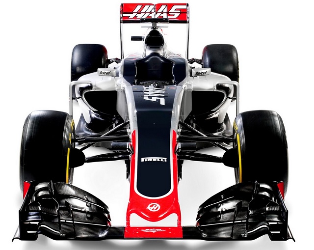
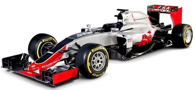
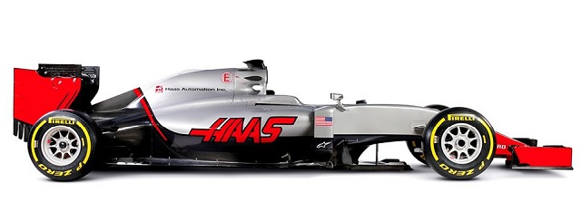
1
GotDAMN that Haas is pretty. The fins seem to be a mixed bag overall, and the idea that there might be a vibration (harmonic resonance?) issue is a bit worrying.
Still, here's hoping for good competition this season.
Posted by: GreyDuck at March 25, 2017 09:24 AM (rKFiU)
Hide Comments
| Add Comment
March 02, 2016
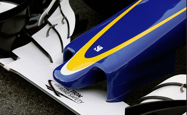
F1 Pr0n: Sauber C35
The fourth oldest team (using current names) on the grid, behind only Ferrari, McLaren and Williams, Sauber F1 finally got their 2016 challenger on track. So what magic does the team from Hinwil, Switzerland, bring us this year?
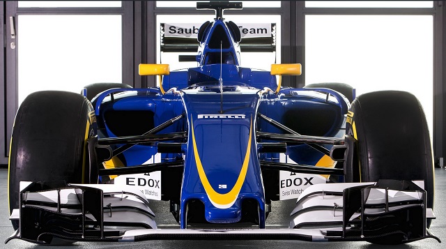
Did you know it rains about half the time in Hinwil, and that the little town has a population of around 10000? Neither did I. What does that have to do with the C35? Nothing at all. About the car, people who know these things say that the front from the cockpit to the nose is, essentially, the same as last year's design as used from Singapore on. For the most part that's fine, but most of the other teams have changed their front suspension to have a unified lower wishbone. Sauber has not, which should incur some sort of drag penalty.. how much and if it's enough to matter is another question. The front wing is, more or less, new and essentially a copy of the Mercedes wing style.
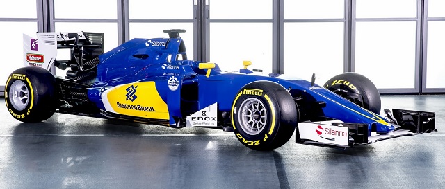
Moving backwards, there's a startling change to the size of the C35's sidepods in comparison to last year. They're smaller, more sculpted, and with a greater undercut to them... very much like the Ferrari, in fact. Which makes sense, since Sauber uses Ferrari power units. It stands to reason that their cooling requirements would be similar. "Similar" doesn't mean "the same" however, and the C35 has larger inlets than Ferrari. Maybe things are packaged differently underneath the bodywork. One completely unique feature of the car is the rear wing support. Everybody else has a single pylon setup last year but Sauber, who kept a more traditional twin pylon design. This year, they've changed to a Y-shaped pylon, probably for weight and aero reasons. We'll know if it works when other teams start changing to Y-pylons.
With luck, the C35 will bring Sauber back to the days where they were right on the verge of joining the Big Four. They're too good to languish in the ranks of the backmarkers.
Posted by: Wonderduck at
10:46 PM
| Comments (1)
| Add Comment
Post contains 341 words, total size 2 kb.
February 29, 2016
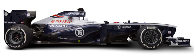
F1 Pr0n: 2016 miniMegaPr0n Part II: Renault, Red Bull, Force India, Manor
The first round of pre-season testing is now complete, and 10 of the 11 new chassis have hit the track. We've already looked at Ferrari, Mercedes, McLaren and Williams in
the first miniMegaPr0n, and Haas got its own entry because
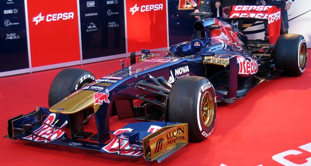
they're just that darn cool. This installment will look at four of the remaining teams. "But Wonderduck," I hear you wail, and I think you need a little tuning, you seem a tad flat, "why not all six?" Well, that's simple. Toro Rosso is running an all-black testing livery that is totally impossible to pick any details out of from the pictures available, and Sauber hasn't debuted their 2016 car at all. So four it is!
So enjoy these on-track snaps and amateur analysis from the duck with the best grasp of F1 in the world, yours truly. And I can make that claim because what
other duck is going to disagree with me in a way anybody could understand?
more...
Posted by: Wonderduck at
09:05 PM
| Comments (2)
| Add Comment
Post contains 863 words, total size 6 kb.
1
Of course, the big question is whether one brand of engine will dominate this year the way Mercedes did last year. We got Mercedes again, Renault, Ferrari (and Honda?); will one stand out?
Posted by: Steven Den Beste at March 01, 2016 12:42 AM (+rSRq)
2
Just as long as there's some kind of actual competition this year, yes? Please?
You're not kidding about the darkitty dark dark liveries. I mean, yes, black-with-highlight-color IS a classy look. But when everything looks the same, blah.
Posted by: GreyDuck at March 01, 2016 11:16 PM (rKFiU)
Hide Comments
| Add Comment
February 22, 2016
F1 Pr0n: Haas VF-16
If you're a fan of Formula 1 coverage here at The Pond, you have this car to thank for 2016. To be blunt, I was leaning towards giving up on writing about F1 unless something important occurred... but then Haas F1 Team joined the grid. Why does that matter? Because they're an American team, based in Kannapolis, NC, with a "forward base" in Banbury, England for the European leg of the season. Yes, I'm rooting for the team on strictly nationalistic grounds, and that's what is keeping me interested in F1 this year.
The livery is based on that used by "parent company" (i.e., both are owned by Gene Haas)
Haas Automation's machine tools. Indeed, the car's "VF" designation comes from them, too. The first machine design they sold was called the VF-1, short for "Very First". As an aside, the Navy fighter squadron VF-16 flew off the second USS
Lexington (CV-16) and were known as "The Fighting Airedales."
The overall design is reminiscent of both the 2015 Ferrari SF-15T and the SF-16H. This should come as no surprise to anybody, since the two teams have a very close technical partnership. Not only is Haas using the 2016 Ferrari powerplant, they also purchased as much as the tech regs allowed from the Italian team. Thus the suspension and gearbox, as well as incidental parts (like brake ducts) are also Ferrari-made. The rest of the design is all Haas, however, and was produced by Dallara for the team.
There's an interesting wrinkle on the nose just behind the suspension mounts. The general school of thought at the moment is that its for some aspect of the suspension, but nobody knows for sure. The tip of the nose is more Mercedes than Ferrari, as it has no proboscis. Obviously there's no way to compare the design with prior Haas cars, but it can be said that it's not quite as refined as, say, the Ferrari bodywork. The sidepods are a little larger, the rear of the car is not as tightly packaged, that sort of thing, but you'd expect that from a first-year design. You don't take as many risks on your initial go-round.
Haas F1 wants points in its initial season. Normally I'd think that was impossible, but for Haas, maybe not. Unlimited windtunnel testing for the past year, plus the partnership with Ferrari, has presented the team with unprecedented advantages over prior new teams like HRT or Virgin. Let's see if they have taken full advantage... testing starts on Monday!
Posted by: Wonderduck at
12:41 AM
| Comments (9)
| Add Comment
Post contains 424 words, total size 3 kb.
1
Do we know who their drivers are yet?
Posted by: Steven Den Beste at February 22, 2016 01:20 AM (+rSRq)
2
Lettuce Grosjean and Esteban! (Gutierrez). Lettuce, obviously, has been driving for a while. Esteban! drove for Sauber in 2013 and 2014, and was a test driver for Ferrari last season.
Posted by: Wonderduck at February 22, 2016 08:26 AM (KiM/Y)
3
I imagine Grosjean can get points if the car supports him. Gutierrez is 24, so unless he's a late bloomer (and keeping in mind we're talking about people who live in rarified air here) I'm guessing he's mostly a seat-warmer until the team proves itself. This all spoken with the normal caveat that I know very little about F1 racing.
Posted by: Ben at February 22, 2016 09:00 AM (DRaH+)
4
But now that I've ruminated a bit, I have a vague impression that Esteban! had a couple of good races for Sauber. His "minor league" career was certainly promising.
Posted by: Ben at February 22, 2016 12:37 PM (LO5Qy)
5
According to Wikipedia, Esteban's best F1 finish was 7th in Japan in 2013.
Posted by: Steven Den Beste at February 22, 2016 03:06 PM (+rSRq)
6
The reason Esteban! is in the second Haas seat is really quite simple: Ferrari wanted him there. Oh, to be sure, his TelMex sponsorship certainly doesn't hurt, but the Scuderia wanted to get him more track time with an eye towards a possible promotion to the Red Team sometime in the future if he does well enough.
The partnership between Haas and Ferrari is really just about one step below full B-Team status... except Haas
really doesn't like that appellation. He's made it clear that he's NOT Ferrari's B-Team, and never will be.
I'm sure having Esteban! in the seat got Haas F1 some serious discounts on engines/gearboxes/etcetera, though.
Posted by: Wonderduck at February 22, 2016 06:52 PM (KiM/Y)
7
That makes sense. Sponsorship and patronage in Formula racing is something a lot deeper than in most other sports, I think.
Posted by: Ben at February 22, 2016 07:18 PM (DRaH+)
8
I sometimes run Haas machines at work, so that livery is pretty much
exactly what I was expecting.
I've already had to explain to two Europeans why the American flag is "backwards" on the right side of the car.
Posted by: flatdarkmars at February 22, 2016 08:02 PM (Ykyrg)
9
I went to Corpus for Christmas break and visited Lex. Took about 3 hours to complete all 5 tour routes.
Posted by: Pete Zaitcev at February 22, 2016 11:41 PM (XOPVE)
Hide Comments
| Add Comment
February 21, 2016
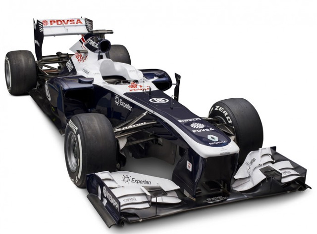
F1 Pr0n: 2016 miniMegaPr0n Part I: Ferrari, McLaren, Williams, Mercedes
With preseason testing starting up at Barcalounger on Monday, many of the teams finally got around to officially showing us what their cars were going to look like this weekend! With this post, I'll touch on the Big Four of Ferrari, McLaren, Williams and Mercedes. The fifth team that debuted on Sunday will get their own post.
Once testing begins, we should see almost all the rest of the cars, and we'll deal with them in Part II. So what will the high-powered steeds of Formula 1 look like this season? Let's get to lookin'!
more...
Posted by: Wonderduck at
11:14 PM
| Comments (2)
| Add Comment
Post contains 875 words, total size 6 kb.
1
To my uneducated eyes, it looks like the Ferrari front wing is smaller and less elaborate than the McLaren front wing or the Mercedes front wing.
Posted by: Steven Den Beste at February 22, 2016 12:37 AM (+rSRq)
2
That may be the case, at least as complexity goes. However, don't read anything into that; these wings are almost certainly going to be radically different by the time they hit the grid in Australia a month from now.
Posted by: Wonderduck at February 22, 2016 12:44 AM (KiM/Y)
Hide Comments
| Add Comment
February 04, 2016
F1 Pr0n 2016: (Not The) Renault RS16
Would you believe that it's nearly that time again? Off in the distance, one can hear the engines grumble and the turbos beginning to whine... or is that just people who want the V10s back, it's hard to tell. Formula 1 is just around the corner, and the first of the rollouts didn't occur today. Now, I know you're assuming that I just typo'd up there, but nope, I meant it: the first of the rollouts
didn't occur today. What did happen, though, is that Renault debuted... something. Ladies and Gentlemen, allow me to not introduce you to something that isn't the RS16!
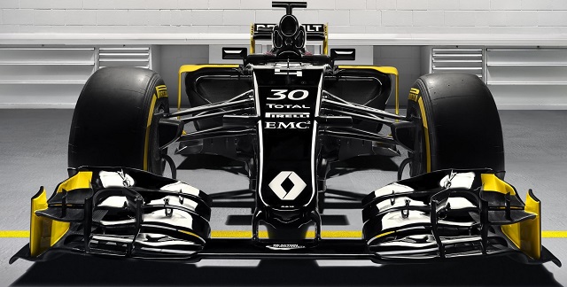
As you may or may not remember, the team known as Lotus was about to go legality-plank-up last year, but longtime F1 waffler Renault eventually rescued them from the abyss. Renault is one of the truly important names in the sport, either as an engine manufacturer, a team sponsor, a factory works team, or all of the above at once. They've raced as Equipe Renault Elf, Renault F1 Team, Lotus Renault GP, and won two constructor's championships on their own. They've also supplied engines to championship teams from Williams, Red Bull and Benneton along the way, making them one of the most decorated marques around. Now they're back, officially known as Renault Sport Formula 1 Team, with their car for 2016, the RS16.
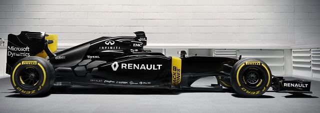
Which, in fact, you are not seeing here. Oh, to be sure, the team debuted the car you're seeing here today in a grand presentation, but this isn't the RS16. See, Renault got into Lotus quite late last season and it's known that the dying team had no design on the table for this year... why spend the money when you're not even sure you'll be able to finish 2015? So Renault had to come up with a design on its own, something that can't be done in just a couple of months. What we're undoubtedly looking at here is the chassis of last season's E23 with the new front wing the team ran in the post-season test at Abu Dhabi back in November. Though you can't see it in these pictures, people who know these things have said that the exhaust on this car looks exactly like 2015, which would be against the tech regs for
this year.
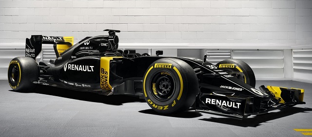
Hell, Jerome Stoll, president of Renault Sport Formula 1 Team, even said that the livery you see here will change by the first race weekend in Australia. So if the car isn't going to be what you see here, and the paintjob is going to be different, why in the world did Renault even have this event today?
To unveil the team. Let's face it, a lot of people were pretty sure that Renault dragged its feet on the Lotus deal because they were lukewarm on the sport. And, considering the grief they took from Red Bull concerning their engine, who can blame them? This event was clearly a "we're back now" thing, and all things considered, a welcome one. F1 is better off with Renault as a manufacturer than without it.
As near as I can tell, this is the first, and last, scheduled rollout of a car until pre-season testing begins in a couple of weeks. We'll keep an eye out, though, just in case.
Posted by: Wonderduck at
09:55 PM
| Comments (5)
| Add Comment
Post contains 559 words, total size 4 kb.
1
I looked up to see if this meant that Lotus didn't exist anymore, and found out that Lotus was already Renault; they just used the Lotus name. And apparently, the Lotus F1 teams haven't had anything to do with Lotus the car manufacturer for years. I had no idea. I understand that Team Doug (for example) could use Mercedes power units; they don't have to provide Team Doug power units...but finding out that Lotus isn't actually
Lotus seems weird.
Posted by: Ben at February 05, 2016 12:08 AM (DRaH+)
2
Yeah, Lotus-the-historic-F1-team-and-car-company basically stopped existing in 1994 or 1995, becoming Lotus-the-historic-car-company.
In 2010, however, we had TWO Lotus F1 teams. The first, Team Lotus, was backed by Malaysia and Malaysian car company Proton, which owns Lotus Cars. The other was Group Lotus, which ran as Lotus Renault GP. Team Lotus technically had the rights to the name; Group Lotus had the backing of the family of Colin Chapman, the founder of the original Lotus.
In 2011, Team Lotus was allowed to use that name, as they were the legal rights holders to it. The other could call themselves Lotus and had the rights to the
legendary black-and-gold livery.
Eventually there were lawsuits. Team Lotus turned into Caterham F1, Lotus-Renault became Lotus F1... until the end of last season, when Renault bought them and rebranded them as Renault Sport F1 Team.
Posted by: Wonderduck at February 05, 2016 08:35 AM (KiM/Y)
3
Am I odd for hoping they don't change the livery too much? I kind of like the yellow spot-color effect.
Posted by: GreyDuck at February 05, 2016 10:28 AM (rKFiU)
4
That's really a nice color scheme. Now if they could get Casio as sponsor they would already have a matching watch: Behold the Casio
F-94WA-9!
Posted by: chris at February 05, 2016 01:22 PM (+v19u)
5
I quite like it too, GD, particularly the matte spots on the rear. I assume that's bare carbon fiber over "hot spots", but I can't find any confirmation on that anywhere.
The livery will change as soon as they get a sponsor willing to cough up cash (see "Williams-Martini"), or enough little sponsors. I'd die laughing at the self-important Euroscum that sneer at all the sponsorship stickers on NASCAR racers if Renault goes that way...
Posted by: Wonderduck at February 05, 2016 07:44 PM (KiM/Y)
Hide Comments
| Add Comment
May 06, 2015
F1 Pr0n: 2015 McLaren Revamp
Back in the preseason that now feels so far away, when the McLaren MP4/30 debuted it looked a little something like this:
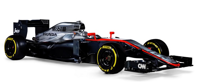
This morning, McLaren decided that it didn't look ominous enough for the European leg of the F1 calendar and debuted a new livery.
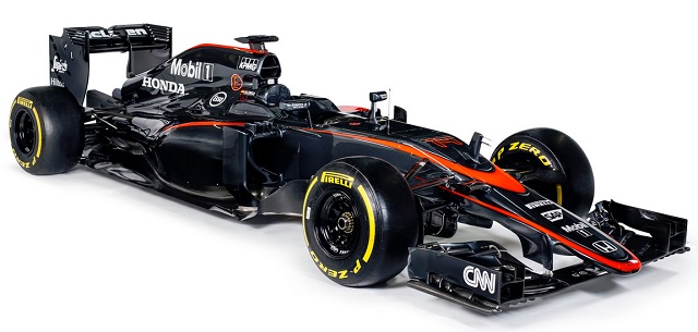
The infamous "glare with wheels" is now completely gone, and the car looks better for it. The new red striping looks pretty flash too if you ask me.
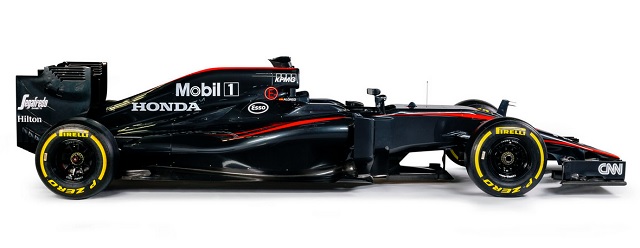
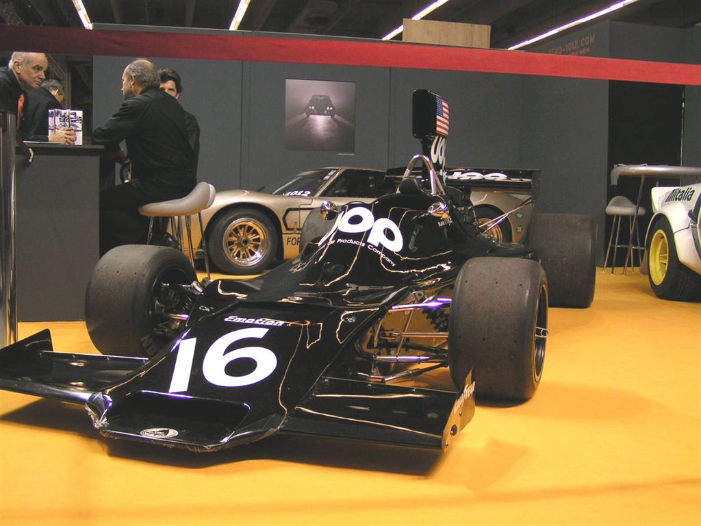
I don't understand why there haven't been that many teams that go all black in the past. Oh, of course there's the historical "nation colors" that gave Ferrari its famous red livery, and British Racing Green isn't just a phrase. But the only team I can think of that normally used all-black was
UOP Shadow in the early '70s.
Minardi's PS01 was mostly black, with white on the upper section of the nose and stripes on the sidepods... and that's about it. So big props to McLaren for going for drama in lieu of useful speed.
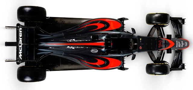
click for bigger
It's like a high school freshman designed the livery. How cool is that??? The red stripes have gotta be worth at
least 10-20mph on the track, right? I'll let ya know after practice on Friday!
Posted by: Wonderduck at
11:41 AM
| Comments (2)
| Add Comment
Post contains 212 words, total size 2 kb.
1
Supposedly someone complained that the old silver reflected artificial light poorly, which matters this season due to a number of night races. That is their official excuse for getting rid of it.
Posted by: Pete Zaitcev at May 07, 2015 05:46 PM (RqRa5)
2
That wouldn't surprise me, Pete. While it's darkened over time, the "glare with wheels" nickname I gave the scheme years ago wasn't just because I was being a little funny.
Posted by: Wonderduck at May 07, 2015 06:03 PM (jGQR+)
Hide Comments
| Add Comment
February 04, 2015
F1 Pr0n: 2015 MegaPr0n
Amazingly, while I've been off being disinterested in pretty much everything the world of Formula 1 hasn't slowed down one whit. The first round of pre-season testing at Jerez is almost finished, and that's swell. We've gotten to hear the new Honda engine, which is cool as heck, but the first test session is often spent working out the kinks and trying to keep the cars running on track.
Unless you're Mercedes this year, who seem to be so confident that they spent a few hours on Tuesday running on Intermediates to see how long they'll last on a dry track. This while McLaren was happy to average less than 10 laps per day in their revamped car.
But the really big thing about the first round of tests is that we finally get to see the new cars... and that's what we call F1 Pr0n around these-here parts! Shall we take a look?
 more...
Posted by: Wonderduck at
11:39 PM
| Comments (7)
| Add Comment
Post contains 1310 words, total size 10 kb.
1
Clearly Red Bull has adopted dazzle camouflage to make torpedo attacks on their cars more difficult.
Posted by: flatdarkmars at February 05, 2015 07:37 AM (h7xWz)
2
There's really no way to get around the fact that the front wing is a big flat box with a lot of crap in it, is there? Is that something which happened over some number of years or has it always been more-or-less like that?
Posted by: GreyDuck at February 05, 2015 08:27 AM (AQ0bN)
Posted by: Wonderduck at February 05, 2015 01:31 PM (jGQR+)
4
@flatdarkmars, Torpedo attacks are allowed in F1 racing? I may have to take time to watch them this year...
Posted by: Siergen at February 05, 2015 04:54 PM (/CwtH)
5
No torpedoes, but railguns are permitted under this year's rules.
Posted by: Steven Den Beste at February 05, 2015 09:03 PM (+rSRq)
6
However, they have to be powered by KERS. That way they can't fire very often.
Posted by: Steven Den Beste at February 06, 2015 03:27 PM (+rSRq)
7
All kidding aside: Thanks for that retrospective on F1 design, there. In a weird sort of way, that makes the current front-wing situation make a lot more sense.
Posted by: GreyDuck at February 07, 2015 10:30 PM (AQ0bN)
Hide Comments
| Add Comment
March 06, 2014
F1 Pr0n: Williams-Martini FW 36
Martini is more than just a drink, it's a company... perhaps you've heard of Martini & Rossi? Makers of the world's best selling vermouth? Yeah,
that Martini! They've also long been a player in motorsports. They've often sponsored teams, including in Formula 1... and they're back. It was quietly announced last week that Williams F1 and Martini Racing have joined forces for the 2014 season, becoming Williams-Martini. F1 fans with a sense of history eagerly awaited the reveal of the new livery... and today, our patience was rewarded.
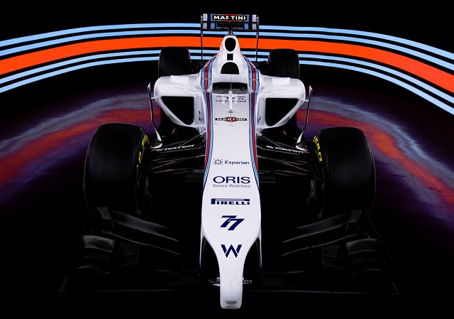
Holy
crap, that's nice. The Martini stripes are just classy as hell, and the white... well, we haven't had a white car on the grid since the Brawn in 2009, and I think it's long overdue. Just
look at it! Just imagine what that's gonna look like under the lights at Singapore!
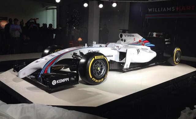
Yup, that's just flat-out purty. I don't even mind the nose!
We're a week away from Practice 1 at Australia... can you imagine?
Posted by: Wonderduck at
10:23 PM
| Comments (5)
| Add Comment
Post contains 168 words, total size 1 kb.
1
If this isn't a violation of the rules, I wonder why no one else did it? Why did they all muck around with weird noses and steps and the like?
Posted by: Steven Den Beste at March 06, 2014 11:23 PM (+rSRq)
2
Williams
didn't change their nose, actually. We just get to SEE it now. Before it was dark blue on a dark blue background with black behind that.
A good livery not only makes the car look better, it makes it go faster, too. Allegedly.
Posted by: Wonderduck at March 06, 2014 11:28 PM (4qAlp)
3
A good livery not only makes the car look better, it makes it go faster, too.
Everyone knows stripes == speed. And this bad boy has FIVE stripes on each side!
The only way it loses is if someone else paints flames on theirs.
Posted by: Mikeski at March 07, 2014 12:00 AM (Zlc1W)
4
Red wunz go fasta, everyone knows that!
(gods, I just imagined a stadium full of ork Tifosi...)
That is one sharp-looking car. Very nice indeed.
Posted by: Avatar at March 07, 2014 04:11 AM (zJsIy)
5
At mid-war WWII fighter planes, one-tone camo was worth about 4 knots, which was not insignificant. So famous aces often flew such when they could get resources to re-sand and re-pain the airplane, and the clout to get away with non-standard livery.
Posted by: Pete Zaitcev at March 07, 2014 03:20 PM (RqRa5)
Hide Comments
| Add Comment
February 19, 2014
F1 Pr0n: Lotus E22
As the second of the pre-season test sessions begin in Bahrain today, we've finally gotten a real look at the last of 2014's challengers for the F1 Championships. Team Lotus looked to make the move to serious, legitimate contender for the big prizes, but rumors of financial difficulties that turned to truths placed the end of their 2013 season under a dark, dark cloud. Meanwhile, missing the first pre-season test in Spain earlier in the year did nothing to dispel said clouds. Still, it's hardly the first time a team hasn't shown up to a test session... and they made it today. So let's see what they'll be throwing at us with the E22!
Well. Pretty conventional, I'd say. Pretty much like the other cars as far as side profile goes, though it does appear that there's an extra exhaust pipe or something like that just aft of the word "clear" on the back of the car. Nose works pretty well from this angle, too.
I... what? Seriously, Lotus? See, when you guys released those renders of the car something like six weeks ago, I assumed that it was some joke or something. It appears that my assumption was misplaced... you really did mount a walrus to your nose.
So here's the gig. The rules say there has to be a single nose tip of a certain cross-section and a very low height. To make this happen, Lotus took one of the tusks and made it longer than the other. This satisfied the regs for a "single nose tip," while letting the team do other stuff... stuff like having a clear unobstructed airway down the center of the car, for example. There are some drawbacks to this, though: the mounting points for the wing are somewhat larger, for example, than the other teams'. Twice as many noses means twice as many airflow obstructions. Of course, all of these things are occurring right where it's best for them to happen so it might be a wash... or a net gain. We don't know yet.
Durn clever, though, and no mistake about it. It'll be even cleverer if it works.
21 days to Australia.
Posted by: Wonderduck at
10:05 PM
| No Comments
| Add Comment
Post contains 366 words, total size 2 kb.
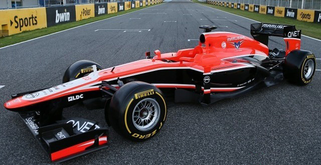
January 31, 2014
F1 Pr0n: Marussia MR3
Thursday was the third of four pre-season testing days at Jerez this session, and finally the good folks from Marussia were able to get their car out on track. It was an epic struggle for that to occur, with the car not working just before they made it there, the transporter apparently breaking down on the way, so on and so forth. But they got the new MR3 out of the garage, making it a full 10-for-10 on teams at the event (only Lotus didn't attend... and their car reportedly needs about 20 weeks before it'll be able to work, according to one wag). So what's it look like?
Baby! That's the epitome of F1 Pr0n, right there! Best looking car of the season, bar none, and it's not even close. I particularly like the air intake behind the driver's head, quite a bit different from everybody else. The nose looks, as has become the norm, completely different from all the others.
The nosecone seems higher that I expected, but maybe that's just an optical illusion. The proboscis has a square pyramid tip to it, another new feature. One drawback of the black livery is that things like sidepod openings just sort of disappear, a black hole on a black background. Still, it looks lovely.
See what I mean? It also looks BIG, though I'm sure it's no longer or taller than the others. Driver Max Chilton just sort of... disappears... in the cockpit, doesn't he? Will the good looks matter? Hell no, not unless a hot livery means you take a second off your time. Otherwise, they'll just look really photogenic as they're lapped for the third time.
Tonight or Saturday, I intend to do a F1 News Recap post, because there's news indeed coming out of Jerez. See you sooner or later!
Posted by: Wonderduck at
08:08 AM
| Comments (5)
| Add Comment
Post contains 308 words, total size 2 kb.
1
That is an awfully good-looking car, agreed. They even managed to make the proboscis look... well, not as horrible as most others.
Posted by: GreyDuck at January 31, 2014 12:45 PM (3m7pZ)
2
Actually, the biggest thing I've noticed is how reduced the side pods are. Instead it has wings on the side and a narrower body. There must be some width requirement they're just filling out, but it looks like they're trying something very different to get the ground effect.
Posted by: Mauser at January 31, 2014 03:33 PM (TJ7ih)
Posted by: Wonderduck at February 02, 2014 10:53 AM (OcKnz)
4
At least this time, I see a box come up.... Let's see if this actually links. Nope.
Trying
again.... Nope, the box got stuck. It gets stuck every time
I try to use the box. As soon as I hit "insert," I get the other box that says "apply" and "ok", and then it doesn't do anything, no matter what you hit.
I'll
try again. I don't think it did anything this time either.
Posted by: Suburbanbanshee at February 02, 2014 04:47 PM (cvXSV)
5
What? It doesn't link until after you get out of the edit box? So basically, you can't test the links with your mouse to see if they're there, without getting beyond the edit box? Wow, that's weird.
Posted by: Suburbanbanshee at February 02, 2014 04:49 PM (cvXSV)
Hide Comments
| Add Comment
January 28, 2014
F1 MegaPr0n: Caterham CT05, Williams FW36, Red Bull RB10, Force India VJM07, Mercedes W05
It's the first day of pre-season testing for the F1 Circus, and while it was a bust as far as on-track action went (nine cars, something around 80 laps total run), it was a huge success as far as getting cars in front of cameras! Ladies and Gentlemen, THIS is
your F1 MegaPr0n for 2014!
Lots of pictures, so click "more" to get started!
more...
Posted by: Wonderduck at
10:08 PM
| Comments (4)
| Add Comment
Post contains 988 words, total size 7 kb.
1
The Caterham design team have to be out of their minds. That thing is going to cause mucho turbulence, and turbulence is a bad thing.
Is that Williams car this season or a historical reference?
Posted by: Steven Den Beste at January 28, 2014 11:31 PM (+rSRq)
2
I'd forgotten the FW26. I seem to remember they only raced it a few times, then put a normal nose back on the car?
Posted by: David at January 29, 2014 12:11 AM (da+4f)
3
I guess I can tell that's not modern; the tail is different.
Posted by: Steven Den Beste at January 29, 2014 01:21 AM (+rSRq)
4
Steven, the FW26 was raced 10 years ago. I found the nose treatment to be remarkably similar to what we're seeing today, is all.
This year's car, the FW36, is also in this post.
Posted by: Wonderduck at January 29, 2014 07:19 AM (UVcMa)
Hide Comments
| Add Comment
January 27, 2014
F1 Pr0n: Toro Rosso STR9
As the temperatures here at Pond Central begin their precipitous plunge towards a predicted -21°F tonight (that's -30°C, folks!), our thoughts turn to the south of Spain. There, nestled amongst the sherry vinyards of Andalusia, is the Circuito de Jerez, a Formula 1-level racetrack used by The Circus for pre-season testing. It is there, under a clear sky and 60°F temperatures, that the fourth of the 2014 rollouts has occurred. Ladies and Gentlemen, allow me to introduce the Toro Rosso STR9!
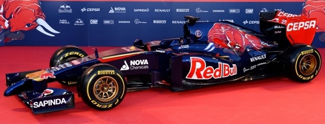
The problem with circuit rollouts is that you don't get glamour shots, but "real" pictures. No straight side shots, no directly-head-on nose shots, that sort of thing. But it's not like we can't see what's what with what we've got, heavens no! Long sloping nose like the McLaren, I actually think it looks really good... until you to the front wing. Hide the children, Mable, this is gonna be bad!
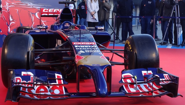
Oh dear god. I hope this is all just a bad dream, that F1 is just trolling all of us. "It's all a joke, you all fell for it, here's what the cars will really look like!" Unfortunately, I know it isn't... the cars are going to actually look like this all season.
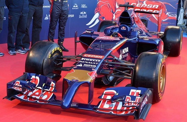
One interesting feature of the STR9 Durante is that it's the first of the cars to not have a center pillar supporting the rear wing. Instead, the endplates run all the way down to the floor and diffuser. The sidepods don't have the complex sculpted undercutting to them that the McLaren and Ferrari have, making it all look very "big shoulder"-y. Or at least as much as a F1 car
can look brawny.
So tomorrow is going to be very busy indeed, as the first pre-season test in Jerez begins... expect there to be a LOT of new cars tomorrow! See ya then.
Posted by: Wonderduck at
07:32 PM
| Comments (6)
| Add Comment
Post contains 312 words, total size 2 kb.
1
Egad, my impression was more like those "Ballz" that some idiots hang from the trailer hitch of their trucks, only attached about a foot from the tip of the car....
Posted by: Mauser at January 28, 2014 05:46 AM (TJ7ih)
2
I'm... confused, I think. It may just be all the cold meds and the early hour, but this isn't the Red Bull car, but it's a Red Bull car?
Posted by: GreyDuck at January 28, 2014 08:22 AM (CUkqs)
3
...never mind. I really AM that out-of-it. There must be a term for the realization which hits right AFTER you click the Post button.
Gah.
Posted by: GreyDuck at January 28, 2014 08:23 AM (CUkqs)
4
Red Bull and Toro Rosso are separate teams who belong to the same guy.
Posted by: Steven Den Beste at January 28, 2014 10:12 AM (+rSRq)
5
I just saw some pictures from the testing in Jerez. I can't wait to read your take on the Caterham...
Posted by: David at January 28, 2014 01:03 PM (Tvi5F)
6
For whatever it's worth, Metafilter just
had a post about how ugly the new cars are.
Posted by: Steven Den Beste at January 28, 2014 04:16 PM (+rSRq)
Hide Comments
| Add Comment
January 26, 2014
F1 Pr0n: Sauber C33
Hinwil. Hardly a city name that inspires visions of glamour and intrigue. Yet it is Hinwil in Switzerland, population 10602, that F1 Pr0n travels to today. For this little town in the Swiss Confederation is the location of Sauber F1 Team, who today rolled out their car for the 2014 season, the Sauber C33!
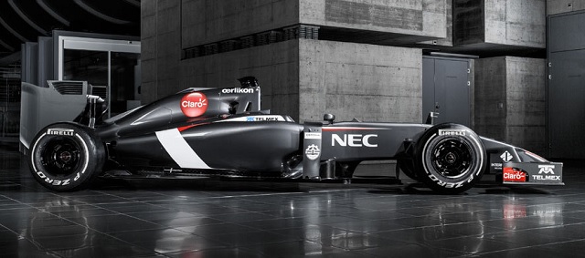
Unfortunately, they did it by releasing just a pair of pictures of a grey car in a grey warehouse with a grey floor. Still, we can (barely) tell what they're doing with the nose!
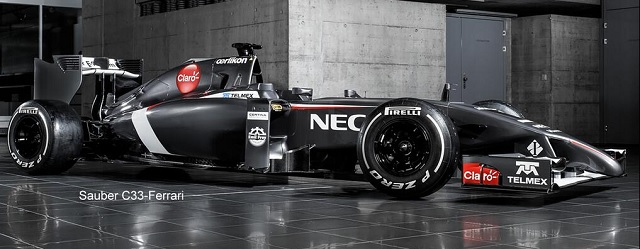
It's looks like it tapers in around the "Diamond I" on the front of the car, as opposed to McLaren's proboscis and Ferrari's Gypsylips. Until we see a front shot, however, we can't be sure just what it looks like for sure. What I CAN say is that it's completely different than the other two we've actually seen to date. Other than that, however? Just not enough detail in the angles we've got to say anything intelligent about the car... which is, truly, par for the course.
Allegedly, the Toro Rosso rollout is Monday... see ya then!
Posted by: Wonderduck at
07:49 PM
| Comments (4)
| Add Comment
Post contains 189 words, total size 1 kb.
1
"...a grey car in a grey warehouse with a grey floor."
I don't see a problem here.

Posted by: GreyDuck at January 27, 2014 08:40 AM (CUkqs)
2
"Every time I press one of these little black buttons labelled in black on a black background, a little black light lights up black to let me know I've done something."
Posted by: RickC at January 27, 2014 09:11 AM (ECH2/)
3
A dark-emitting-diode, eh?
Posted by: Steven Den Beste at January 27, 2014 10:01 AM (+rSRq)
4
"What does it say?"
"Don't press this button again."
Posted by: Mauser at January 28, 2014 05:47 AM (TJ7ih)
Hide Comments
| Add Comment
January 25, 2014
F1 Pr0n: Ferrari F14T
Despite their recent drought as far as championships go, the big team in Formula 1 is still the band from Maranello. Today, Ferrari debuted their car for the 2014 season, the F14T. Interestingly, the name was picked by the rabid tifosi in an online poll. I wonder if anybody noticed that it spells "FIAT" in l33t? Anyway, I understand the "T" stands for "turbo", but I'm just old enough to remember when teams were able to bring a spare car to the track, aka "the T car." Whenever I'll look at the F14T name, I'm going to inevitably think of it as the "Ferrari F14 spare."
But enough of the ruminations of an old, bitter man. What does the thing look like anyway?
Completely different style of nose from the McLaren, but equally legal. I suspect we'll be seeing this type of thing at each and every rollout: how will each team interpret the new rules, and which interpretation will be the best? It's not as ugly as the McLaren, but something tells me that the Glare on Wheels might actually have the better solution. Interestingly, the Ferrari has much smaller sidepod radiator inlets than the McLaren. Clearly
they don't think they'll have cooling difficulties.
Oh geez. What looks acceptable from the front suddenly looks really, really ugly from the 3/4 position. The MP4-29 has a nice clean arc from cockpit to tip. This is like the 2012 stepped nose that everybody hated, mixed with a substantially lower termination point... yick.
I actually like this; as long as I don't have to look at the nose, the car looks good. I even like the paintjob... the less Ferrari Red on the track, the better. In comparison to last year's car, the back half of the F14T is bigger, so as to fit all the new engine components and such into it. Sidepods don't seem to be as steeply undercut as they have been in past years, either. We'll see!
Ferrari decided to give us a nice glamour shot as well... click for more, and no staples!
more...
Posted by: Wonderduck at
11:03 PM
| Comments (4)
| Add Comment
Post contains 356 words, total size 2 kb.
1
From the top it's pretty, but that 3/4 view.... yikes!
Posted by: David at January 26, 2014 02:42 AM (da+4f)
2
I'm starting to learn that F1 has just as tight of manufacturing specs as NASCAR seems to, which is starting to strike me as weird. I always thought there was a larger difference between cars on the track, spec wise...
Posted by: Tom Tjarks at January 26, 2014 10:59 AM (76G0j)
3
Tom, NASCAR is
much tighter on specs than F1. There, the cars must literally fit a specific template exactly (which one depends on the brand of car) with no variation.
In Formula 1, the car must fit into a series of bounding boxes: the car must be such and such long, such and such wide, the front wing must be so-and-so long, and so forth. That's why the cars all look roughly the same. That's what "Formula"
means.
However,
inside of those boxes, you can do anything the rules allow, which is why we've now seen pictures of three cars (as opposed to renders), and three completely different noses, for example.
Yes, it used to be much less restrictive (see:
Tyrell P34), and it's a shame that those days are gone... but F1 is still much less restrictive than NASCAR.
Posted by: Wonderduck at January 26, 2014 08:53 PM (UVcMa)
4
That's something that has actually drawn me closer to F1 the last few years. I've always been more a fan of the engineering than the driving (not to disrespect the driving, of course). Now that NASCAR is a custom frame and manufacturer-sourced identical engines, it seems like F1 allows more room for tinkering by the builders.
Posted by: Ben at January 28, 2014 09:58 AM (Oftf2)
Hide Comments
| Add Comment
January 24, 2014
F1 Pr0n: McLaren MP4-29
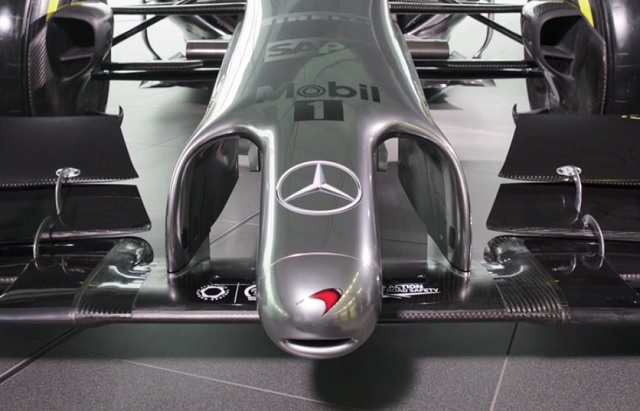
Every year around this time, something special occurs. The hibernating F1 Circus begins to stir, shaking off the accumulated dust and tireclag of the offseason. It used to be that the big Red team would be the first to stumble out of the cave, blinking and sneezing, but no longer is this the case. This year, it's the Glare on Wheels that's made it's way into the light first... not only that, but it stopped to pose for some pictures. So, let's kick off the new season with some true F1 Pr0n, the debut of the McLaren MP4-29!
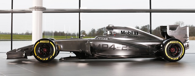
New regulations this year require a very very low nose, with the front wing attached to it by twin pillars, and you can see that quite clearly in this shot. What you don't see is the thinner rear-wing elements required, or the larger sidepod intakes needed to help cool all the new engine stuff required for the turbocharger and larger KERS battery pack. No, that's all visible from the front... so let's see that sexy, sexy front view, shall we?
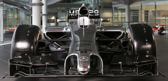
Off in the distance, I hear the sound of retching and wails from those weak of heart: "Dear god, what in the name of all that's holy is that?" I'll admit, even though I knew it was coming, the new eatanter nose is... um... er... what's the term I'm looking for here?
Ah yes:
Fugly. No other word even comes close to describing the travesty foisted upon us by the FIA rulebook this year. I mean, dear heavens, just look at that thing... who could really like that?

Ladies and Gentlemen, McLaren's biggest fan.
However, all is not lost... the little team from Woking has one tradition that they haven't thrown away quite yet: the glamour shot! Click "more" to see what I'm talking about... but not until you put the kids to bed.
more...
Posted by: Wonderduck at
10:48 PM
| Comments (4)
| Add Comment
Post contains 368 words, total size 3 kb.
1
That's... quite a proboscis. Wow.
Posted by: GreyDuck at January 25, 2014 12:06 PM (CUkqs)
2
I still like it more than the stepped front slopes from last year.
Posted by: Avatar at January 25, 2014 02:17 PM (IopVv)
3
Silver Platypus.
Also, testing.
Posted by: Ben at January 28, 2014 09:41 AM (Oftf2)
4
Meanwhile, the most striking, innovative, and controversial part of the car turned out to be in the rear and thus missing from the pr0n shots.
Posted by: Pete Zaitcev at January 31, 2014 04:35 PM (RqRa5)
Hide Comments
| Add Comment
February 19, 2013
F1 Pr0n: Williams FW35
And thus, the last shall be... um... last? Williams F1, the legendary "final privateer", has had a bad run of it as of late. This team, one of the truly great Formula 1 names, hadn't won a race since 2004, and really didn't even seem like they were even close. In 2011, in fact, they were 9th in the Constructor's Championship with a paltry five points. Ah, but last year they came up off the mat with a win by Holy Man Maldonado in Spain, leading some to hope that the team was on their way back. Let's see what they can do with their new car, the FW35!
Well, nothing too out of the ordinary here at the nose view. It's a high nose, the highest of them all in fact, but that's probably an effect of the modesty panel. Williams claims that the FW35 is "80% new" from last year's car, to which I reply, "Sure. Why not?"
Very low cut sidepods, designed to handle a new exhaust system... in fact, pretty much the same one Caterham is using. Oh, and the one the FIA is probably going to rule illegal. Whoopsie! One clever thing the team will get away with is "blown wheel nuts." Near as I can tell, air comes in via the brake ducts, flows through a hollow axle, and out holes flush with the wheel nuts. This air fills in the vacuum around the center of the tire, which improves the aerodynamics. Red Bull tried this same trick last year, but theirs was banned because it extended past the wheel nut. Who knows? I didn't hear about it! I love the shape of the nose/front wing struts on this car; very almost art-deco-y.
All in all, it's a workmanlike car for a blue-collar team (if anything in F1 can be called "blue-collar"). Will it win? That's the question. The team is on the wrong foot by missing the first test session, but if that extra few weeks was needed badly enough for whatever reason, then it had to be done. I for one hope Williams is on the ascendance again. We shall see in just a few weeks!
Posted by: Wonderduck at
09:46 PM
| Comments (6)
| Add Comment
Post contains 368 words, total size 2 kb.
1
I see a fin on the top air scoop. I don't remember seeing anything like that before.
Posted by: Steven Den Beste at February 19, 2013 11:20 PM (+rSRq)
2
That's the official FIA-mandated camera mount, Steven. All of the cars have one.
Posted by: Wonderduck at February 20, 2013 07:28 AM (plIxv)
3
I'm surprised at how complex the forward spoiler is. That seems to be the most complex of all the cars you've shown us so far.
Posted by: Tom Tjarks at February 20, 2013 11:10 AM (T5fuR)
4
I can see which driver is which on Williams cars (this year and last, at least) from the side (which is all we ever see during the race, no?) and without trying to see the red pixels instead of the yellow pixels on a two-by-six inch patch of the car at 200 mph, or guess which helmet which guy is wearing this week.
Because they seem to be the only team that cares about the audience more than absolutely required by the regs, they're my midfield team, even if they're slower than Caterham. Pity they missed the first round of testing, though.
Tom Tjarks - I'm guessing that this is production front spoiler, where the rest were "placeholders". That being one of the sections they can modify after homologation, why give the other teams your ideas? Could be wrong, but let's see what gets shown in Melbourne.
Posted by: Mycroft W at February 20, 2013 11:24 AM (Z484j)
5
Wonderduck, I'm not talking about the T-bar on the top. I'm talking about a thin fin about 3 feet by 1 foot by real thin, extending diagonally from the top of the air scoop along its back down to the chassis. The other cars don't have anything like that.
Posted by: Steven Den Beste at February 20, 2013 07:17 PM (+rSRq)
6
Ah, the "shark fin." A couple of years ago, they were all the rage and ran all the way to the rear wing. Now they still exist (check out the
Ferrari for one similar to the Williams, and the
Sauber for a vestigial version) for airflow reasons, but they're hardly
the obnoxiously huge ones that we used to see.
Posted by: Wonderduck at February 20, 2013 08:41 PM (plIxv)
Hide Comments
| Add Comment
February 05, 2013
F1 Mega-Pr0n: Toro Rosso STR8, Caterham CT03, Marussia MR02
The last three of the new cars that we'll be seeing for a while came out today (well, Toro Rosso came out yesterday, details details), and instead of doing an individual post for each, I'm throwing them together into a F1 Mega-Pr0n!
The Toro Rosso STR8 is probably going to be very very fast, but unable to turn worth a darn. Last year's STR7 had seriously undercut sidepods; though it's hard to see here, the new chassis has done away with that. This is going to allow the weight of the radiators to be set lower down, which should balance the added drag of the larger pod, which has a new triangular front opening. As with all the other designs, the rear of the sidepods taper down quite steeply (aka "The Red Bull Style"). The team also redid the rear suspension design, allegedly allowing for more choices during setup. I find the clear plastic vanes on the top of the sidepods to be endless fascinating... I can only assume that's being done to allow the sponsor's name to be read more easily. All in all, a fairly conventional update over last year's design.
Unlike the STR8, the new Caterham CT03 DOES have majorly undercut sidepods, the Red Bull Style, and dear god in heaven they're not using the modesty panel. Bless their hearts. The big news here is that the bodywork at the back half of the car has been greatly redone, and apparently drew quite a bit of attention from the other teams in testing today... to the point where the tech regs are being hauled out to discover if it's all legal. A nice metallic green paint tops off a great paint-job... shame the rest of the car is so ugly! Put a panel over that thing, please!
When Marussia was known as Virgin Racing, their first car was designed and tested entirely in computers, no wind-tunnel testing or anything like that. The car tanked. Last year, the MR01 managed to beat HRT while also being totally designed using Computational Fluid Dynamics. Yay. Now here, the MR02 comes out and good merciful heavens, it's gorgeous. Perhaps not so coincidentally, it's spent significant time in the wind tunnel. It's also the first design this season to have a nicely curved airbox; everybody else has straight lines and sharp angles. Lotus and McLaren have a rounded-ish airbox cover, but nothing like this. It's a beautiful car... mainly because there are practically
no sponsor stickers on it. That's a bad sign,but we can appreciate the look until they go broke. If they do. The main change to this car is the addition of KERS, which of course isn't going to be externally visible. See, Caterham, it's not that hard to make the car look good!
So there we go! The only car left to debut is the Williams, scheduled for February 19th at the second test session. We'll keep an eye on testing in case anything interesting happens... F1 is right around the corner, folks!
Posted by: Wonderduck at
09:55 PM
| No Comments
| Add Comment
Post contains 513 words, total size 3 kb.
February 04, 2013
F1 Pr0n: Mercedes W04
If Force India isn't the most disappointing team in Formula 1, Mercedes is. Taking over BrawnGP after that team's one and only season, in which they won both Championships, Mercedes then brought Slappy Schumacher out of retirement to lead their team. They promptly peed the first two seasons down the leg of their firesuits. Last year, they got their first win behind Nico Rosberg, sent Slappy back to retirement, and threw their wallets at Shiv Hamilton to lure him away from McLaren. I've heard this described as a mere marketing ploy, and there certainly is some of that involved, but it will prove important in other ways. For one, Shiv is a much better driver than Slappy, which should show on-track. For another, Hamilton can actually spend time in the simulator without getting sick all over everything, unlike Schumacher. Back in his old Ferrari days, when teams had unlimited testing, Slappy was a legend, pounding out lap after lap after endless lap, and giving back immense amounts of technical feedback for the engineers to work with. Now that teams can't do that, they rely on simulators... and Slappy gets sim-sick. So now they'll get better simulator results from two good drivers. But will the car underneath Rosberg and Hamilton be any good? Here's our first look at the Mercedes F1 W04...

It's already being called the "ducknose." While it IS an improvement, cosmetically, over the
W03, that's not exactly saying a whole lot as that chassis was monumentally ugly, even in a season where most of the cars were homely. There's a bunch of little changes from last year's car visible in this shot. For example, the outside edge of the sidepods are now turned up, better to shovel air towards the rear of the car. The airbox over the driver's head is now just a single piece, instead of having a main intake and then a smaller one behind it. The radiator inlets are smaller and mounted higher in the sidepod. There's even new mirrors.
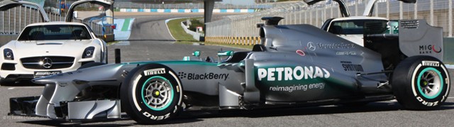
As with most everybody else, Mercedes seems to be copying the Red Bull style of sidepods/exhaust on the W04. Again, if you're gonna steal, may as well be from the best. The nose has the modesty panel in place, and it still looks hideous from this angle.
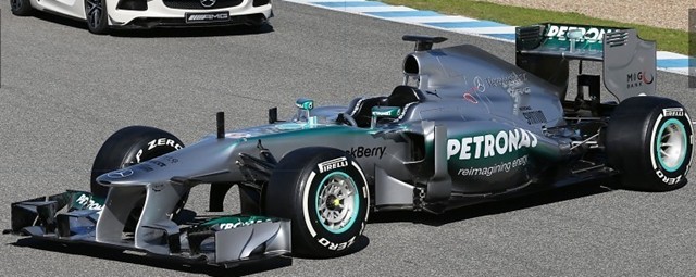
However, if it wins races, it'll be beautiful in no time. I think part of the cosmetic problem is that it's a rounded nosecone joining to an essentially square fuselage. Just by definition, that's gonna be awkward. The technical websites out there are all saying that the W04 is a step back from the overly complex W03 (that ate tires like ducks eat bread) to something more aerodynamically clean. The front wing is the same one that was run at the end of 2012, so expect something new there.
Okay, it's hideous. Will the addition of Hamilton make it pretty? We'll see soon enough!
Toro Rosso rolled out today as well; I'm moving them to a F1 MegaPr0n tomorrow along with Caterham and Marussia. See ya then!
Posted by: Wonderduck at
11:24 PM
| Comments (4)
| Add Comment
Post contains 514 words, total size 3 kb.
1
And there just happens to be an SLS parked behind W04. And speaking of things made possible by the visible light spectrum, can't say I'm a fan of the turquoise. I guess that's a Petronas color?
Posted by: Ben at February 05, 2013 09:57 AM (/Mdmg)
2
I"m assuming the 'modesty panels' you are referring to are the little wings outside of the pods on the side of the car? I'm not understanding their purpose. Can anyone point me to a resource that might help explain them?
Posted by: Tom Tjarks at February 05, 2013 12:04 PM (T5fuR)
3
Tom, the "modesty panels" that I'm referring to are the new nose coverings that hide the fugly platypus of last year's car. What you're referring to are called "barge boards", and they're aerodynamic aids, steering air to the right place on the car.
Used to be that cars would be festooned with bargeboards, fins, winglets, canards and anything else the aerodynamicist could design... look at some of the cars from 2006 or so... but now they've been mostly legislated away, and good riddance.
Posted by: Wonderduck at February 05, 2013 12:17 PM (OS+Cr)
Posted by: Tom Tjarks at February 05, 2013 12:30 PM (T5fuR)
Hide Comments
| Add Comment
February 03, 2013
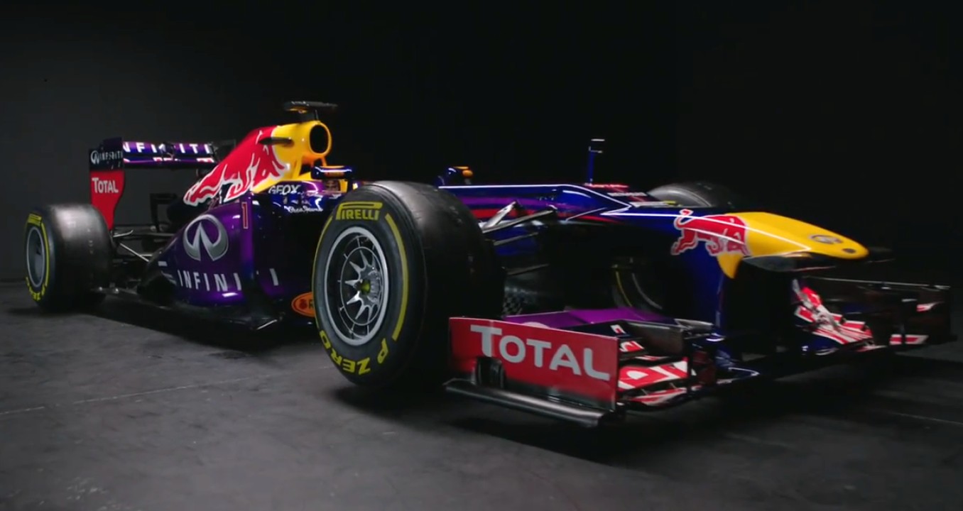
F1 Prawn: Red Bull RB9
It used to be that when a team had a roll-out, you could actually, y'know, see the car. Pictures would be taken, questions would be asked, people would "ooh" and "ahh", and we'd all be impressed. And the World Champions would be the most anticipated debut of all, with everybody flocking to the event and documenting every nanometer of the chassis with a fine-toothed comb. And then, you have today's coming-out party for the Red Bull RB9, the Adrian Newey design that will defend the team's three consecutive championships... where they didn't allow media photographs. Where all the team has released are a couple of computer renderings of the new chassis. And a video called "
Rhythm of the Factory," showing the basic steps of constructing the car. This makes it very difficult to do a F1 Pr0n for the RB9, because I'm NOT going to review a render, no matter how pretty. I made that mistake a couple of years ago with the HRT... never again. So what do we have to work with? Well, a screencap from the video:

Click for larger
What can we tell from this? Well, the obvious thing is the nose... the RB9 has a hybrid platypus. It's using the modesty panel, but it's a short one to improve airflow over the bump, while saving weight at the same time. I hate to admit it, but that's clever. The double-step isn't unattractive, either. They've also changed the color scheme, to reflect the new Infiniti sponsorship. I
like the pearlescent purple; I'm actually surprised nobody else has used pearlescent colors on their cars. True, they're no longer "The Blue Cars" but oh well.
I want to get more and better pictures of the RB9 before I do a real F1 Pr0n for it, so this'll have to do for the moment.
Posted by: Wonderduck at
09:04 AM
| No Comments
| Add Comment
Post contains 310 words, total size 2 kb.
104kb generated in CPU 0.3145, elapsed 0.3878 seconds.
61 queries taking 0.3334 seconds, 216 records returned.
Powered by Minx 1.1.6c-pink.


