January 31, 2011
F1 Pr0n: Sauber C30
Of the three rollouts today, only Sauber released studio glamour shots of their steed, so let's give them the attention they richly deserve!
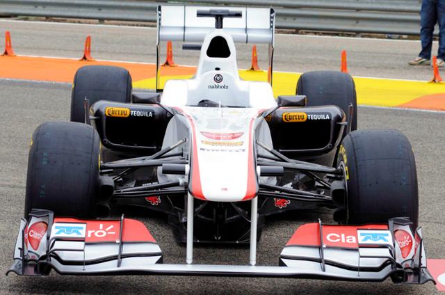
Yes I know, that's not a studio shot. Well, they didn't do a studio shot of the nose. We take what we can get 'round these parts. Again, let's compare to last year's car. Unlike the Ferrari, the sidepod intakes sure look larger than on the C29... in fact, the sidepods as a whole seem bulkier, at least from the front. It's a high nose, but that's more of a carryover from the 2010 chassis than a copy of the Red Bull. However...
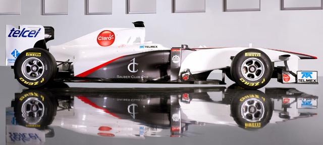
...it has more of a droop than the C29. Maybe it's an optical illusion, but the nose seems more pointy than last year's. The shark's fin stretching to the rear wing is gone as well. After looking at the side view, I'm pretty sure the sidepods are bulkier. That can mean one of two things: one, the KERS unit takes up more space than I expected, or two, they expect to have cooling problems, leading to bigger radiator units (ergo, the larger inlets). Or something else altogether... it's so hard to tell with a F1 car. It might be simple aerodynamics, too.
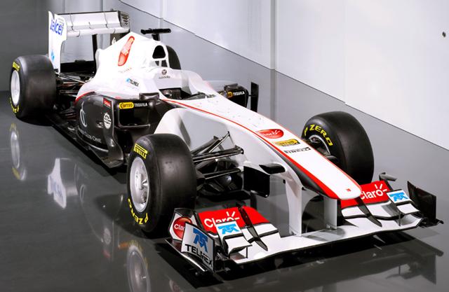
I dunno... I think I prefer the looks of the C30 over Ferrari's F150. I'm just not sure if that's because it's really a better looking car, or if it's because I despise Ferrari so much. The addition of sponsor logos is welcome; it might let Sauber actually advance the design during the season. I was going to comment on the proliferation of Mexican-based business logos (Cuervo tequila, Telmex, Telcel, Claro), until I remembered that Sergio Perez is driving for Sauber this season. The addition of some color to the livery helps the looks, too.
Of course, looks don't win races... if they did, Lotus would have won every race last year.

Yes I know, that's not a studio shot. Well, they didn't do a studio shot of the nose. We take what we can get 'round these parts. Again, let's compare to last year's car. Unlike the Ferrari, the sidepod intakes sure look larger than on the C29... in fact, the sidepods as a whole seem bulkier, at least from the front. It's a high nose, but that's more of a carryover from the 2010 chassis than a copy of the Red Bull. However...

...it has more of a droop than the C29. Maybe it's an optical illusion, but the nose seems more pointy than last year's. The shark's fin stretching to the rear wing is gone as well. After looking at the side view, I'm pretty sure the sidepods are bulkier. That can mean one of two things: one, the KERS unit takes up more space than I expected, or two, they expect to have cooling problems, leading to bigger radiator units (ergo, the larger inlets). Or something else altogether... it's so hard to tell with a F1 car. It might be simple aerodynamics, too.

I dunno... I think I prefer the looks of the C30 over Ferrari's F150. I'm just not sure if that's because it's really a better looking car, or if it's because I despise Ferrari so much. The addition of sponsor logos is welcome; it might let Sauber actually advance the design during the season. I was going to comment on the proliferation of Mexican-based business logos (Cuervo tequila, Telmex, Telcel, Claro), until I remembered that Sergio Perez is driving for Sauber this season. The addition of some color to the livery helps the looks, too.
Of course, looks don't win races... if they did, Lotus would have won every race last year.
Posted by: Wonderduck at
09:39 PM
| Comments (4)
| Add Comment
Post contains 324 words, total size 2 kb.
January 28, 2011
F1 Pr0n: Ferrari F150
The offseason is over. F1 has come back for 2011 with the traditional first rollout of the season, Scuderia Ferrari! This morning they debuted their new chassis, the F150 (nope, no truck jokes here... yet). So what does it look like?
Like this:
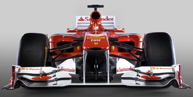
Pictures of last year's car can be found here, and may be useful for comparison purposes. Two things immediately leap out at me. First off, the nose is higher. It's more like Red Bull's 2010 challenger, the RB6, then the Ferrari 2010 car, F10. Well heck, it worked pretty well for Red Bull last year, and in Formula 1 if it works, it gets copied. The second thing visible is that the air intakes on the sidepods are more horizontal than last year. The intake above the driver's head is rounder as well.
Let's take a look at the rest of the car, shall we?
more...
Like this:

Pictures of last year's car can be found here, and may be useful for comparison purposes. Two things immediately leap out at me. First off, the nose is higher. It's more like Red Bull's 2010 challenger, the RB6, then the Ferrari 2010 car, F10. Well heck, it worked pretty well for Red Bull last year, and in Formula 1 if it works, it gets copied. The second thing visible is that the air intakes on the sidepods are more horizontal than last year. The intake above the driver's head is rounder as well.
Let's take a look at the rest of the car, shall we?
more...
Posted by: Wonderduck at
08:51 PM
| Comments (2)
| Add Comment
Post contains 498 words, total size 3 kb.
<< Page 1 of 1 >>
18kb generated in CPU 0.0148, elapsed 0.2853 seconds.
46 queries taking 0.275 seconds, 115 records returned.
Powered by Minx 1.1.6c-pink.
46 queries taking 0.275 seconds, 115 records returned.
Powered by Minx 1.1.6c-pink.


